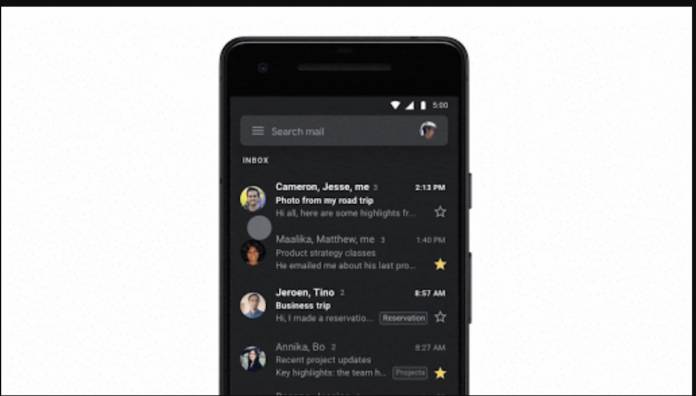
If you’ve always wanted to read your email in the dark, you will finally get your wish. Google is finally rolling out the long-awaited and much-requested dark theme for its Gmail for Android app. It actually started rolling out to selected users at the beginning of September when Android 10 started becoming available but now we have an official announcement as well as an estimated timeline as to when users can expect this to arrive on their devices.
The dark mode is actually not exactly black but more of a dark shade of grey. You even get a bit of lighter grey when it comes to the full-width search field at the top of your app. The navigation drawer also sports the same kind of lighter grey. You get white text for the sender, subject line, and time when you’re sending a new message while the message body preview itself is grey. For the read emails, you get the same fainter color.
You also get less bright colours for generic avatars, labels, and other colors that may affect your eyesight as well as your phone’s battery life. The Android home screen widget will also adapt the dark grey color but profile images however remain unaffected, color-wise. The body of the email uses white text as well but the darker signatures may be harder to read because of this dark mode.
If the device is running Android 10, it will follow the system default “Dark Theme” setting. And if you enable your Battery Saver, then Gmail will also automatically switch to the dark mode. But you can also switch it on manually of course by going to the Settings > Theme and then choosing dark mode.
The rollout has already started and it will take at most 15 days before feature visibility will be available for all Gmail users. It will be available for both regular Gmail users and G Suite editions as well.


