Do you remember the days when you could only type on your phone using a physical and touching the screen only results in fingerprint marks? No? Well children, that’s how cellphones started back in the day. But now keyboards are virtual and tapping and swiping on your screen is the best way to maximize your probably almost bezel less device. People seem to love apps that are taking advantage of all that swiping that you can do and now some Google apps are adding more swiping features. Gmail is now making the swipes customizable while Google Keep now lets you indent items simply by swiping.
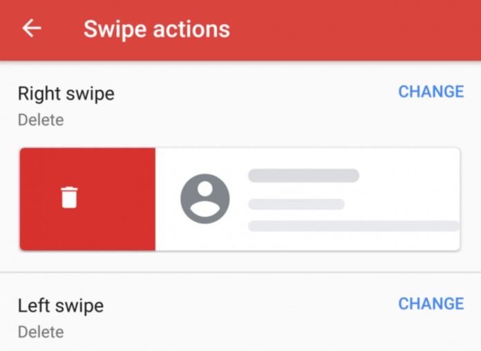
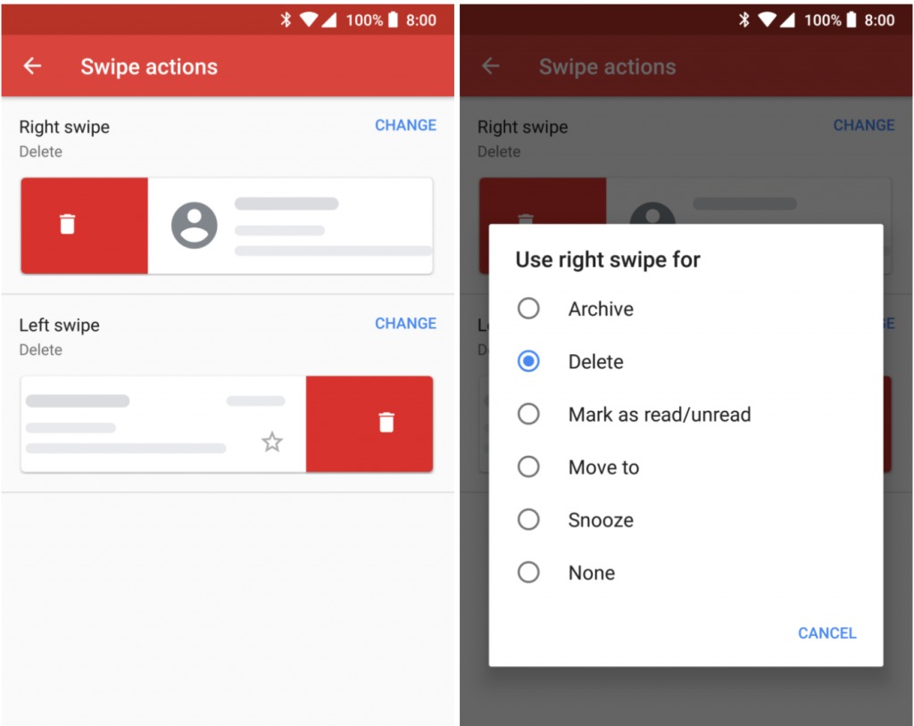
The Inbox app by Google was probably one of the first email apps (along with Apple’s Mail app and Newton) that introduced contextual swiping. And when this feature finally came to Gmail, people were already happily swiping away to snooze or archive or delete their emails to achieve zero inbox. However, users wanted something more and now finally Gmail is giving it to them. When you update your app to the latest version 8.5.20, you will now be able to customize your swipe actions. Just go to your settings, and when you tap on the Swipe Actions section, it will open up to a new menu on a separate page.
You can now choose what action you want to put on either the Right Swipe or the Left Swipe (no up and down options for now). You can choose from the following actions: Archive, Delete, Mark as read/unread, Move to, Snooze, or no swipe actions if you actually don’t want to use it. Since you only have two kinds of swipes, you should probably choose the two actions that you use the most, whether it’s for the goal of achieving zero inbox (aka you have a huge backlog of emails) or just dealing with the tons of emails that you receive every day.

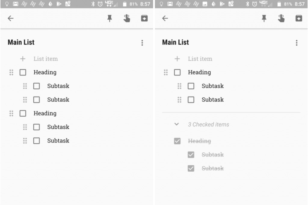
Meanwhile, for those who have been using Google Keep for their notes and lists, one of the most requested features is a way to indent items in your list in order to create sub-items. The update which has already started rolling out now lets you do this and all you have to do is to swipe right. When you open any list on your Keep app, you will see a tip or hint telling you to swipe right if you want to indent an item and then swipe left if you want to bring it back to your main list. However, you’ll only get one sub-level for now, although ideally they should allow more levels eventually. You can also check off a sub-item once you’ve finished it or move it to other lists, whether as part of the main list or a sub-item as well.

What other contextual swiping actions do you want to see in other Google apps? And do you prefer customizable actions or you’re okay with the standard ones because customizing would only confuse you further?


