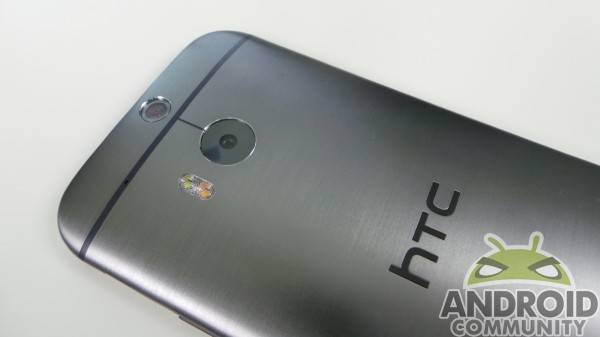
Though we like the new HTC One (M8), there are a few things giving us headaches. The device is still top-end and wildly popular, and like anything else, has some features and settings that frustrate. Things you may not notice in-store while you’re fondling your potential new handset aren’t always immediately evident, so keep these things in mind when you’re ready to hand your credit card to the cashier.
Keyboard
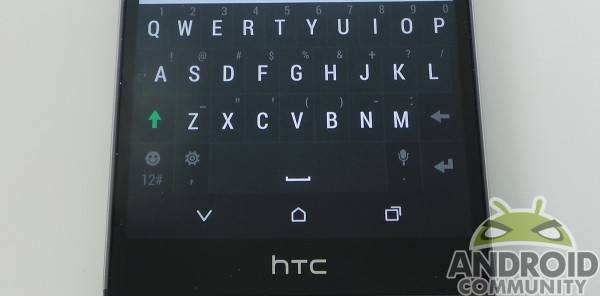
The HTC keyboard can be maddening, plain and simple. The keys don’t register, which is likely due to sensitivity issues. Often times, a space key press doesn’t register, giving run-on words. From there, the keyboard often has no way to figure out what you meant when you typed “idontknowificanmakeit”, so you’re stuck doing it all over again. A calibration may help (found in settings), but it’s still not great in our experience.
The layout is also not quite intuitive, with question marks and commas hidden behind letter keys rather than cobbled behind one key as the stock Android keyboard offers. It’s kind of a pain, and switching to Google’s keyboard is almost necessary. The easiest way to do that is to drag down the notification bar when you see a keyboard icon up there, and select the Google keyboard.
Screen
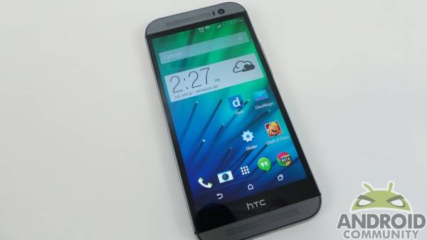
Don’t get us wrong, the screen is gorgeous. Color reproduction is sharp, and the touch capacity is usually stellar. When you consider what’s actually being displayed, the screen is marvelous.
What isn’t marvelous is the bezel around the whole of the display, which smacks of unnecessary in 2014. The sides, the top and bottom — all have a noticeable black bar that never seems to blend into oblivion. It’s just kind of always there unless you’re watching a movie trailer or something, in which case it just makes the screen look like it’s shrunk the image. The prominent HTC branding on the front also annoys us quite a bit.
Aluminum
Another thing many don’t consider about the One (M8) are the cons faced with aluminum. It absolutely gives the device a more polished appearance, and it’s definitely classy — there’s no debating that. It’s got quite a bit of downside, though, and you should really consider this aspect before purchase.
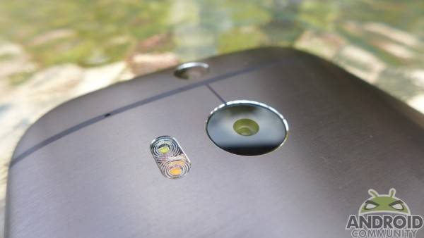
The One (M8) is really slippery, there’s just no getting around it. The redesigned aluminum casing is a bit more rounded, and a lot sleeker than the original One, but there have been several instances where I cringed because I nearly dropped it. The One (M8) takes a firmer grasp than you might think. Thankfully, HTC has a one-time, free of charge screen replacement for new owners.
The aluminum, in being so svelte and sleek, makes even the tiniest abrasive elements noticeable. Set it down on a desk, and it may end up sending chills down your spine because it’s grinding against tiny particles you don’t see. It can be mitigated with a case, but if you don’t like cases (I don’t), this is something to consider.
Icons
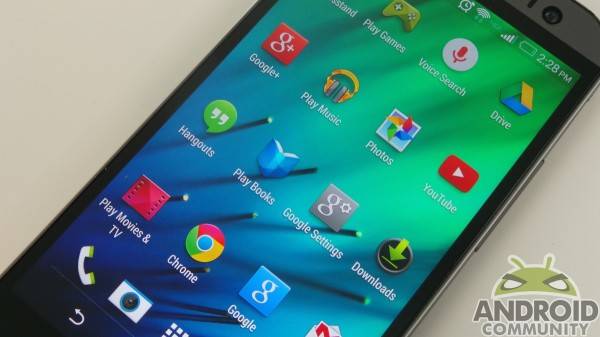
Icons on the home screen and app drawer are spaced quite a bit, making it necessary to have more screens than you might like. If you’re a fan of folders, it might not matter too much. If you like having all your apps out and strewn around, it’s a bit sparse for our liking. They look to be simply scaled from smaller screens, but it doesn’t work well on the HTC One’s 5-inch display. Even more frustrating is that you can change the app grid layout in the app drawer, but not the home screen.
Power button
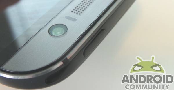
The top of the device is a dark plastic, which makes HTC Sense TV worthwhile because the IR blaster has somewhere to send a signal from (it likely wouldn’t work well through aluminum). This is also where the power button sits, and where we find our lone issue with HTC’s button arrangement.
The power button is a bit wobbly, and often sits askew. It can be felt shifting in place as well, which causes us to worry it may not be sturdy. We envision a time when it stops working altogether, or breaks off for someone who may be a touch rougher on their device.
Conclusion
These may not be make-or-break issues for the HTC One (M8), but they are things to watch for. Should you want to pick one up, we still highly recommend it. It’s a fantastic device, but not without its own unique issues. If you’re easily bothered by little things, these are just a few to look out for before you hand over your credit card.


Sounds like someone dropped their shit…
These are simply the stupidest things I have ever heard that are wrong with a device the only thing I can see in this that was good to bring out would be the power button everything else just stupid
I agree. this sounds like they just wrote the page for the sake of having an article out.
I always use invisishield-esque protectors on the rear of all my phones. Doesn’t change the appearance of the phone, but definitely adds a lot of needed grip and protection.
Really? Sometimes I wonder why I come to this site and read the RSS feed.. Lousy, pointless articles. You really think people will not buy this phone because it has a slippery back? Or because you can’t use the stock keyboard? Just install another keyboard.. Why is that so difficult? The power button, still no issue. It may be that way to prevent it from sticking. I have held this phone, and it didn’t slip from my fingers. But then again, I have the grip of a full grown man. It makes me wonder sometimes if there will ever be a phone on this planet that will satisfy such people as yourself; those that complain about the most forgettable things on a device. Feed removed..
Looks like you was really trying hard to find anything to put here. I am glad all you found is such a BS. It just confirms my opinion about this phone – it is perfect 🙂
all i really dislike are the 4 mp cams (love the 5 mp front cam) and the ugly HTC bezel which HTC says is necessary but a poor execution
Wow. Don’t try to withhold bias or anything. I encountered some of these issues on the M7 and they persist on the M8.
#1 The side bezels being large is annoying from a design standpoint. I was never a fan of the black border around the M7 but obviously the bottom bezel wasn’t as annoying then because there were capacitive buttons there. This new on screen button layout means the HTC logo area should have been deleted all together or the three stock Android button controls should have stayed in that area to make the 5.0″ screen fully usable. Now the screen is back to being only 4.7″ approximately. I have a 4.5″ Moto G with on screen buttons and in Chrome if you measure diagonally the actual screen real estate is only 4.2″ because Chrome doesn’t have an immersive mode. Now that’s wasted space… Right now I also have a Note 3, if you’ve ever used one you can recognize how small the lower bezel can be yet still have capacitive controls in it. The Note 3 feels like “all screen” sometimes especially relative to the wasted-space heavy M8.
#2 The aluminum is definitely an issue; my M7 got a grain of sand or dirt under the lip of my Seidio Surface case and created a very ugly pit in the aluminum from being trapped there for a little while. I’ve never had an issue like that on any polycarbonate phone. This makes aluminum a CON in my book. I’ll choose polycarbonate over aluminum any day.
#3 The horribly low grid layout on the M7 I had to fix by using Nova. I couldn’t stand the wasted space on the desktop and in the app tray.
These grievances aren’t BS. They actually are issues. Every phone has issues. Nothing is going to be perfect. You sound as bad as a iPhone fanboy.
Right. Is it me trying to call opponent names? Who is a fanboy here?
OK, I actually don’t care.
I am not measuring my screen with measuring tape. I am also not buying aluminum body phone to discover later on that aluminium (miracle!) is easily scratches. I do not use stock HTC keyboard and do not like it any more or less than Samsung stock keyboards – I do not see how this is phone’s issue. I Do not have issue with power button, it is solid enough for me. Bottom bezel has antennas under it, I checked it in different forums before buying the phone and do not see why to start whining about it after buying it. I used M7 before and loved it, I use M8 now and love it too. I used HTc phones from Windows Mobile tumes. I started my Android experience from Nexus One. I used in different times LG Nexus 5, Samsung GS3, Different Blackberries and hated it for different reasons. I got back to HTC as fast as I could when M7 came out. And I say the reasons in the article are sucked from the writer’s finger. You can put 10-15 reasons like these on any phone. This article is only way to say “I really did not find anything seriously bad about this phone, but I had to write something”. And I feel good about it 🙂
2/5 things are software based, so that’s nice (I have a GPE version).
I can agree with the aluminum and screen thing, to an extent. It IS slippery, and I do wish the bezel could be smaller on the bottom. I did think the bezel was more of a problem when looking at the device than it actually is in person. I wish it was smaller as well, but I do think the boomsound speakers are WELL worth it and I probably wouldn’t have gotten it if it had the same button setup as the M7. For me it’s onscreen buttons or bust.
I also agree on the power button, but the motion gestures help a ton. I just wish there was a way to add a power off gesture (or button).
How are you liking the GPE? I’m not usually a fan of skinned devices, but Sense isn’t bad at all.
I’m really a fan. Then again, I’ve almost exclusively used Nexus devices before. I’ve tried sense multiple times in the past (HTC Desire, HTC Sensation, HTC One S) but end up going back to stock.
Also, unlike the GPE M7 (where buttons forced work around gestures like double tap etc), I actually feel like this is the first GPE (from anyone) where stock belongs on this device. It’s very natural.
The main thing that I (think I) miss is the new UI on Sense and the double tap to turn off motion gesture. I’ve always wanted built-in burst mode and I’m starting to want slow motion recording. The ufocus feature still exists (and is really the only feature of the duo camera I’d use), and the motion gesture to turn on is still there which is the only way I see myself managing the horribly placed power button.
Really, for me, the little design changes stock uses and fast updates overwhelmingly make up for those two.
Is there really anything in particular you prefer on Sense?
Prefer? That’s a tough one. I like a lot about Sense, but I can’t say I’d go nuts if I didn’t have it.
I really enjoy the app drawer customization. I’ve found myself taking advantage of the “most recent” setting a lot.
I am a Nexus guy, too, but I really like the new Blinkfeed. For getting info, especially from social media, it’s awesome. It doesn’t cull info from email and searches like Google Now, but that’s still available as well.
If you like UFocus, check out ‘Foregrounder’. It’s neat for effects, and builds on UFocus. The 3D thing is gimmicky to me. I don’t see much use for it, really.
I like the double-tap to wake the screen, but wish they would have let that happen when the phone is on a desk, like the G2. Probably a patent issue there, but I’d like to have had that.
I totally agree on the double tap on the desk, but I actually take advantage of the M8’s shape here. I’ve found that the gestures activate for any movement whatsoever, not specifically picking up the phone. So I do one tap on the right (or left) side of the phone while it’s on a desk and the curved back will make the phone wobble. From there, any gestures can be activated. Not ideal, but three taps instead of two is still nicer than picking the phone up IMO.
I used to customize the app drawer on custom launchers, but now I just use folders for my most used apps. For most recent apps I just go through the recents button. That’s one thing I like about stock: most people like the 9 grid of recent apps, but I like the ability to scroll and have more apps show up.
Can’t speak for Blinkfeed, unfortunately. I haven’t used it for long enough to really give it a chance. But I was never a fan of random news info on screens (like Flipboard or Newsstand). They’re beautiful, but I have a ton of news to go through (and hardly enough time to casually browse); I want to get through it in sorted fast order. I use Press a ton. I could see why some would like it, though.
I guess to make my question easier, I’d say do you miss anything from stock (updates aside)?
Triple tap. Interesting. I’m going to give that one a go.
I think the ‘most recent’ setting works for me because I cycle through so many when reviewing or beta testing. Otherwise, the recents button is fine for me.
Blinkfeed is great for casual info, but I’d never rely on it for anything other than a social media aggregate/skin, which is its best purpose. Otherwise, I use Feedly.
As for things I miss, I guess it boils down to familiarity. Sense is pretty close to stock, really — it’s just skinned. It has a few takes, obviously, but it’s not nearly as hard to navigate as TouchWiz or LG’s overlay. There are still things I am used to when picking up a Nexus or Moto X that have become second nature, and sometimes Sense just gets in the way of it (button arrangement is the first thing that comes to mind). It’s usually nothing more than an extra button tap or additional screen (maybe an extra setting here or there), but it’s enough to get my attention and snap me back to reality.
I will say that if someone were to force my hand to use this device exclusively, I wouldn’t be upset. It’s a great handset, and HTC should be really proud. This really is the One we have been waiting for.
I looked to see what I missed…I didn’t miss anything…picky, picky, picky
I think it is more to save battery. I too just tap the side of the phone to make it wobble, then double tap to turn on the phone. It is habit now and not an issue at all.
I agree with the bezel and the power button.. at least for the latter as you said there’s a solution for turning the screen on, BUT also for turning it off: there are a couple of apps that let you do it very easily (even more than the double-tap to turn it on, and don’t even require root); one is called “proximity screen off” – which includes a screen-off shortcut (that you can place on your homescreen or even launch bar) that works perfectly even if you don’t use the main function of the app, and the other is “gravity screen” – which is the best if you’re one of the folks (like me) who prefer to lay their phones ‘screen down’, because when you do it automatically turns off (using the gyroscope)
An assassin sent from Samsung?
Lol. What a rubbish article. It made me laugh. Sound like a teenage fanboy. Seems like you’re clutching at straws to be honest.
Screen, icons and power button are simply stupid complaints. 2 or the 3 can be changed easily, and the power button complaint is just silly. As to aluminum and the screen, just absurd. Instead of fabricating a column for clicks, why not give a thorough review? Just silly….
I couldn’t agree more with the replies on this article. It’s as if the author is just looking for things to complain about.
I’ve never had an issue with the keyboard.
The only bezel that is thick is he bottom bezel, and I don’t mind it at all.
I understand the aluminum’s ability to scratch, but the phone looks premium and feels so good in hand. I almost always use cases, but with this phone prefer it naked.
Icons… Really?
Power button: a non issue with the double tap
Conclusion: while every phone has it’s quirks, I can’t think of a better phone on the market than the HTC One (M8) right now.
You’ve made up my mind. After reading your ‘article’ and the comments below it, it looks like the M8 is a GREAT phone. Can’t wait to get it!
I ditched my note 3 for the M8 and I coulnt be happier. Yeah its a smaller screen and I kinda miss the usb 3.0 charging speed. But its well worth it the audio is amazing and the design is perfect, not slippery at all for me.
Disagree all 5 of them.
Did htc fix thier camera issue with the purple haze in low light on the m8 ,have not heard much on this
No. It’s still there just like it was there on the HTC HD2 & HTC
Desire HD. Thankfully, we now have the ability to capture images raw and
can easily fix it. Overall I must say that I’m not that impressed by the
camera but when shooting raw & processing the images to 16 bit
uncompressed PNG files they are actually less muddy than the jpg images
the iphone 6 produces. HTC should really work on their glass and color
profile tho.Im also very disappointed that My phone has No IS. I would rather have IS than the dual camera and would recommend others consider the HTC ONE E8 over the M8.
It is apparent the writer of this article has not owned an m8. Everything he spoke about that was nice about the phone he would turn around and say a negative thing about it… Well which is it? Either you like it or you don’t, this is the worst article I have ever read in Android Community. I have owned the Galaxy S4 and now own the m8. There is nothing about this phone I can complain about. Samsung in the other hand relied on gimmicks to make their phone stand out, apps which I never used or saw a need for. HTC in the other hand is very user friendly and thought about the consumer making their product of the best quality. Like I said I went from Apple to Android and this is the best Android phone I have ever owned.
while I agree that M8 is (finally) a good phone with good QC from HTC, it is too much of a stretch to claim that HTC is very user friendly and though about the consumer while implying that the rest of the brands do NOT.
And really, you just need to look at HTC’s hamfisted way in the past (over zealous task killing feature that basically disabled multi tasking, the insistent on no SD card .. until the recent reversal, the continued insistent on non removable battery, the non-removable blink feed that was only made removable and an option after a big out cry etc) to see that they are NOT always customer friendly.
Well, they did add an SD card this time, right. So I think they are customer friendly by changing the things which aren’t liked costumers like adding an option to remove Blinkfeed for example. How many companies do that, man?
I had the same problem with the power button on my Thunderbolt. Button was garbage.
1.) Dumb Branded Bezel At Bottom of phone
2.) Dumb Branded Bezel At Bottom of phone
3.) Dumb Branded Bezel At Bottom of phone
4.) Dumb Branded Bezel At Bottom of phone
5.) Dumb Branded Bezel At Bottom of phone
Nasty stuff, that’s why I didn’t buy it.
I actually love the keyboard, idk about the newest version but in sense 5 it’s the best imo.. I agree with the bezel and the power button, but for the latter as you said there’s a solution for turning on the screen AND also for turning it off: there are a couple of apps that let you do it very easily (even more than the double-tap to turn it on, and don’t even require root); one is called “proximity screen off” – which includes a screen-off shortcut, and the other is “gravity screen” – which is the best if you’re one of the folks (like me) who prefer to lay their phones ‘screen down’, because when you do it automatically turns off (using the gyroscope)
Wow…. Nitpicking much? “The power button is a bit wobbly, and often sits askew.” Who but the most OCD-riddled person is going to worry about that? I’ve owned the One (M8) since launch and have never even noticed it.
How about how they broke the calendar app. If you use multiple calendars in Google calendar, it no longer works. you get your main calendar and nothing else. Not helpful for frelance workers, or anyone who shares calendars. I talked to tech support, they have no plans on fixing this, although it worked fine on the M7. I am trying to return my M8 now, I can’t use it for business.
That’s HTC black bar at the bottom. Look at how ugly it is, how high it throws the keyboard up and how tall it makes the phone. They should have at least put the three buttons there if they couldn’t remove it. SMH
Good honest review. Didnt touch on short battery life though
It doesn’t have short battery life at all.
– Keyboard: HTC’s keyboard is pretty good. And I don’t say pretty for nothing, the sexy trace when you’re sliding your fingers over the letters make it very pleasant to use. So I have to disagree with you there.
– Screen: This is probably your best point. I hate HTC’s bezels… they’re absolutely atrocious.
– Aluminum: I use a clear case for my M8. It’s mandatory, you always need something to protect your phone. And with the case I have case, I don’t have to worry about losing grip… all the while leaving the aluminum build exposed.
– Icons: This is probably your worst point. I’m not saying you’re wrong, yeah the icons are far apart. But what I am saying is that no one cares about this, because it’s one of the most trivial things ever.
– Power Button: It’s not annoying when you’re turning *Off* your phone, because you’re no longer using your phone and therefore reaching for the power button is not a chore in any way/shape/form. I do however see your point when I am turning *On* the phone; it’s much more of a hassle then. Luckily, we have gestures.
tl;dr …
Keyboard: You’re wrong.
Screen: This is your only valid point, and I think you’re absolutely right.
Aluminum: Should be using a clear case anyway.
Icons: No one cares.
Power Button: Gestures are the cure.