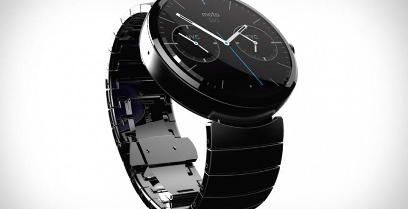
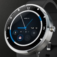
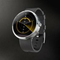
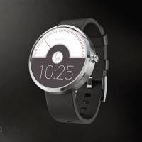
As Motorola tries to catch up to its rivals in terms of wearable technology, their design competition for the watch face of the Moto 360 drew in over 1,300 entries. The 10 finalists were announced on Motorola’s G+ page and now users may +1 their favourite entries until June 24 with the most votes getting the chance to be the design of the brand’s smartwatch.
In keeping with the minimalist but technological feel that Motorola was going for when they announced their call for entries last month, the 10 best chosen from thousands of entries reflected this look. Unlike other wearables like Samsung’s Gear 2 and the upcoming G Watch from LG, the Moto 360 has stuck to the classic round face design found in most watches.
However, looking at the finalists, as sleek and as modern as they look, it seems like the entrants were designing for a watch rather than a smartwatch. There wasn’t much room for notifications or even a spot where you can read short emails and social media posts from friends. Among the 10, there was only one who added a special feature to their design, which is actually a compass, something you can already find in ordinary watches.
Motorola, looking to bank on the crowdsourcing kick that brands have these days, will be looking at the winning design to see if it is actually feasible to make it the actual design of the Moto 360 or to just draw inspiration from it. They are looking for a beautiful design that will also function well given the features that users are asking for from smart watches. Voters can head over to the G+ page and +1 the design that they think best fits this criteria.
SOURCE: Motorola
Here are the 10 finalists


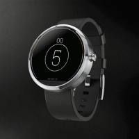
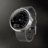
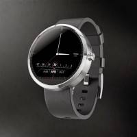
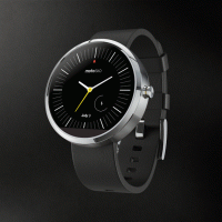




I don’t feel like i’d buy something in this retro design, but the first one – from the banner, not these finalists – is quite beautiful. This round face will not work well with notifications and web content (if it can browse the Internet), unless it changes the face whenever have to show something and uses very small fonts.
Most of them are fugly