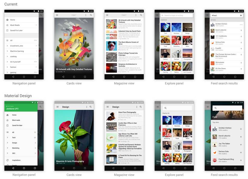
If you are a user of Feedly and have wondered when the app would be updated with material design, the update is in the works. Feedly developers are showing off the upcoming material design update and while it looks very similar to the original design, it uses Google’s newest design language.
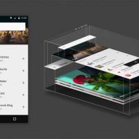
The developer says that he attended a material design workshop and during that four core principals of material design surfaced. He says that he used those four core principals in his updated Feedly app. One of the principals is that in material design each pixel lives on a sheet of paper with a flat background color with a size to serve the required purpose.
Feedly uses cards and fits with that principal easily according to the developer, articles in Feedly live on cards that user’s swipe to change as they read. The explore panel slides in from the right to let users find new feeds to check out.
There are several other principals applied to the app for material design including placement of the content on screen and the colors and imagery used. Transitions were also tweaked to fit with material design principals. In Feedly the biggest transition happened when opening and closing articles. The app gets the Touch Ripple effect when the article is interacted with for instance. There is no firm date offered on when the material design update will land for Feedly.
SOURCE: Medium


