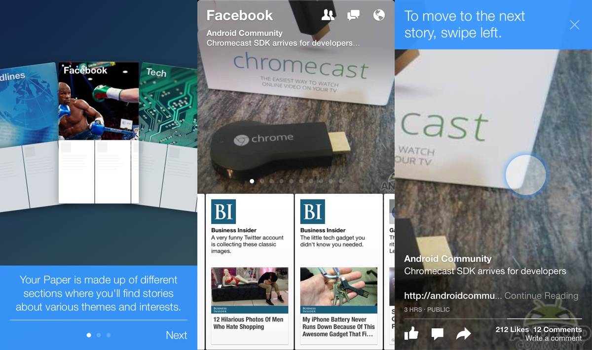
With Facebook Paper, we get a brand new — and better — way to access Facebook. Though released for iOS ahead of Android, there is no reason to think Facebook will not be releasing this for Android in the future. Hopefully we see it soon, but for now, we’re left to check out the iOS version. Is it worth anticipating, this new Facebook?
In a nutshell, absolutely. The scope of Facebook Paper is to give us a new way of accessing our News Feed, and by virtue, Facebook in general. Though News Feed is front and center, as it always was, we now get a more gesture-based environment to see it in. The new Facebook is a far cry from the old Facebook, but manages to feel the same.
An appropriate update, Paper is likely going to be the new way to access Facebook for those who use it. In our time with Paper, we’re not even tempted to re-visit the stock app. By accessing topics, Facebook aims to give you things to discover. It keeps the stuff you already view under a “Facebook” tab, but others like “Tech” bring new things to the fold.
When you first use Paper, you’re given the option to access topics like the aforementioned “Tech”, but also a slew of others. Even the silly things like “Cute” are around, but also more thoughtful topics like “Ideas”. Once you’re done picking topics — if you do — Paper splits the screen, giving you the header up top, and side-scrolling topics underneath. So, if you’re in “Tech”, you’ll find some highlighted stories blinking across the top, and you can scroll through others on the bottom.
To read a topic, you simply swipe up from the bottom of the article, and it goes full-screen. Then it is the familiar bottoms-up scrolling you’re used to for reading the entire piece. To get it to reduce, a quick scroll down will show an opaque down arrow, which you grab and drag to bring it back to full screen. Another swipe down gets you back to the topics and such. Refreshing is equally easy, as a simple drag up inside the topic refreshes the stream and gets you back to square one.
Your notifications, friend requests, and messages are still up top, too. If this is what we get with Android, we’re on board. Gesture based and beautiful, Paper in going to be our new way to access Facebook on iOS. We just need it to make its way to Android to really make it a winner.


This actually sounds like Facebook learned from that whole Facebook Home debacle… I hope they bring this to Android soon just as it’s described here in the article.
They will bring it to Android… eventually. But if it’s anything like the Facebook app, it will be a big, bloated, clunky pile of crap with as many permissions as they can possibly jam in there!
Unfortunately, you’re probably right…
It won’t be same experience as it is on iOS because of android’s GUI limitations.
fffffffffffffffffffffffffffffffffffffffffffffffffffuuuuuuuuuuuuuuuuuuuuuuuuuuuuu
poor android 🙁