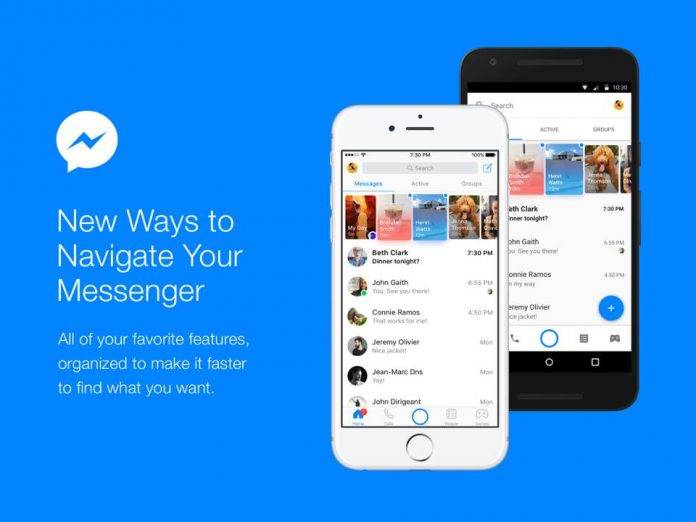
There are several things we are sure of in this world, and one of those is that people will complain whenever Facebook tinkers around with one of its products. So get ready for some people ranting on social media that their Facebook Messenger has changed so much and isn’t the same anymore. Well, that’s because they did change and it and it has undergone a redesign. However, all the previous elements are still there but they’re now just more streamlined and supposedly easier to find and navigate.
The top of your inbox now has three tabs: Messages, where you obviously see your messages; Active, where you can find all of your friends who are currently online and using Messenger; and Groups, because a lot of us actually use the messaging app to talk to several groups for work and for pleasure. The bottom bar meanwhile has five buttons: Home screen so you can always go back to the main page, Calls for when you use Messenger to make free audio and video calls, Camera button which is not as prominent anymore unlike before, People where you can search through your contacts, and Games where you can play games of course.
They will be rolling out the Discover tab soon and it will appear on the bottom bar as well. Through this section, you will be able to search for bots that can supposedly make your life easier, nearby places if you’re looking to try something new, and business related to your interests. The bottom bar will also have a red dot to show you that you missed something and so you can catch up on it.
The new look of the Facebook Messenger app will be rolling out to Android devices this week. It’s not as drastic a change as some people think, so give it a shot first before declaring that you’re giving up on it and switching to a new app.
SOURCE: Facebook


