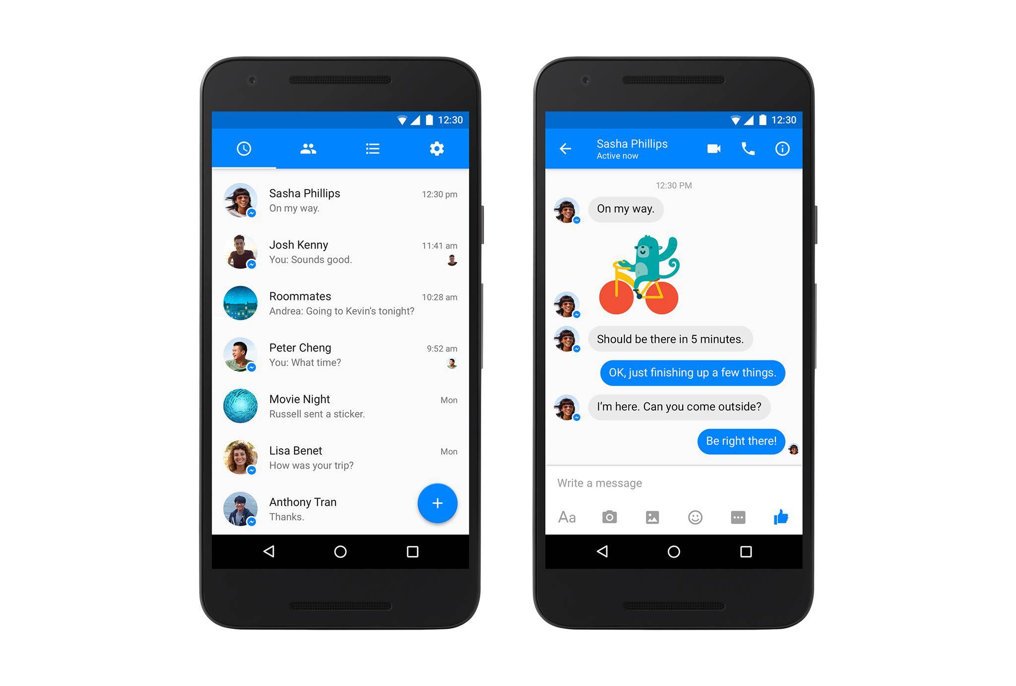
Facebook Messenger has generally looked the same across all platforms, whether it’s the web version, the iOS one, or the Android app. But now, it looks like the last one is branching out on its own as the messaging app has been updated to look more like an Android app. The newest update to the app adapts the already ubiquitous Material Design guideline that Google has been strongly suggesting to developers and apps the past year or so.
Messenger’s head David Marcus took to Facebook of course to announce that they are finally giving a new look to the app after numerous requests to have it follow the Material Design. He admits that it took them a while because they wanted to make sure that they got it right and that their hundreds of millions of users will “truly enjoy this evolution.” But now you’ll be able to see elements of the design that you’ve seen in other apps, including a floating action button so you can start a new chat right away.
But aside from the design overhaul, there doesn’t seem to be any other changes or even new features for the app in this update. That’s okay though, as the Material Design makeover seems to make you feel like you have a new app, which can be both a good thing and a bad thing. However, as noticed by some sites, the new Messenger looks a lot like the Google Messenger, which some of you may be using as well.
So you probably have to be careful that you don’t send the wrong kind of message on either of the two apps. The rollout for the update has already started so you should be receiving it anytime soon.
SOURCE: Facebook


Too late. They had over 2 years to finally get this done. And with a name as big as “Facebook” you’d think they would have been one of the first. Since that time they could have got it done, I have happily switched over to Google+.
They need to bring back SMS support. And hangouts needs a public api.