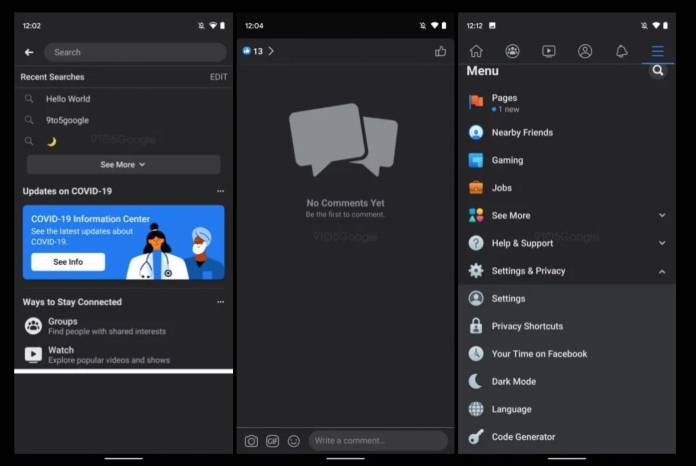
While most of the apps on your Android 10 device probably have their dark modes already (and you have your system-wide dark mode option too), there are still some that are holding out for one reason or another. Facebook, at least the main app itself, is one of those that still do not have that option on their native app. But that may soon change as we are seeing screenshots of the full rollout of this, along with other additional features including a coronavirus tracker and a new UI for its Time on Facebook tool.
9 to 5 Google shares some screenshots of what the dark mode will look like in its stable version for the Facebook Android app. We’ve previously seen some versions but this will reportedly be the final one that will roll out. It uses dark grays and almost-black shades and shows up in settings, posts, and the home feed as well. When you switch modes, you’ll see the Facebook blue accent color and white.
One other feature we may see soon is a coronavirus tracker that will show you data on local cases. Based on the leaked screenshots, it will show you three weeks of cases and wider country-wide cases over seven days. If you want to see global data, there’s also information about it at the top of the page. While you can always search for these things on your browser, having them on an app you always use can be useful.
The “Time on Facebook” feature may also get a UI overhaul. We will soon get a grid-based interface that separates the different sections of this digital well-being tool so it will be easier to move around the sections. There doesn’t seem to be anything new here except for how it looks but we’re seeing a “Quiet Mode” name even if the functionality has been there before. If you haven’t checked out this tool, maybe you should if you think you’re spending way too much time here.
We have no idea yet when these features will roll out but it will probably be soon. Other Facebook apps like Messenger, Instagram, and even Facebook Lite already have dark modes so it’s only a matter of time.


