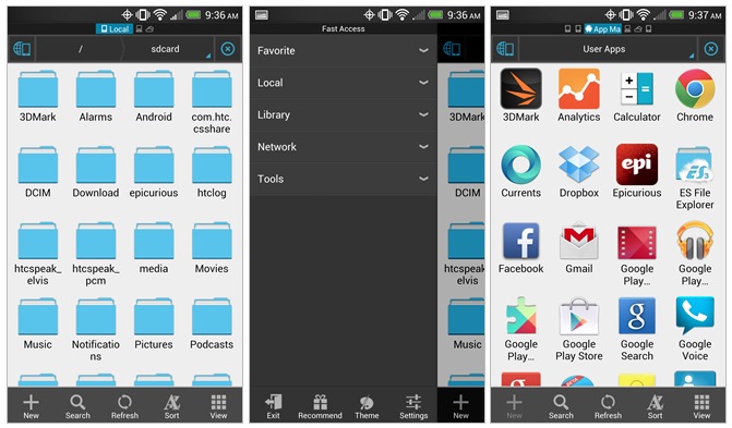
For all those who haven’t already settled on a File Explorer for their Android devices or are looking for a powerful and awesome option, today ES File Explorer just got a lot better. If you’re not a Root Explorer fan, ES File Explorer has tons of features and options and today’s update improved the UI and added tons of impressive features. It still doesn’t quite have the Android Holo look, but it’s getting closer.
ES File Explorer and Manager has been around for a while, and has tons of loyal users even though previous versions had a pretty terrible user interface. Today they’ve updated to version 3.0 with a brand new look and feel. It still doesn’t abide by Google’s Holo standards, and the tabs on the bottom aren’t our favorite, but it’s certainly a step in the right direction.

While the tabs are on bottom (and not up top) they are swipe-able which is nice, and they’ve incorporated slide-out navigation bars and such too. The slide-out bar they are calling “fast access” and it works as expected by tapping menu, then the entire UI is very polished compared to their previous offering. Here’s the full changelog:
– New UI
– Fast Access(Press menu)
– Multiple Windows
– Send Files By WiFi
– Gestures(Drag,Zoom,Slide)
– Classic Theme
– New Picture,Root Explorer,Tools
It still might not be the cleanest File Explorer available but they certainly have no shortage of features. The new send files by WiFi is a welcomed edition, and something we’re sure many of you will find extremely handy. Overall we like the changes but if you don’t, there’s a classic theme available to keep it familiar for those that don’t like change. Give it a try from the link below and enjoy.
[via Android Police]


