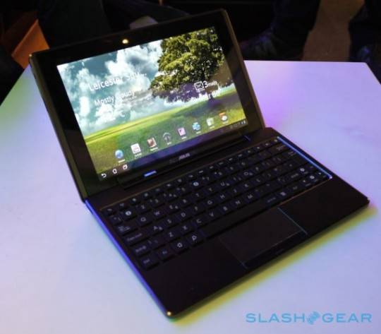
Asus has launched it’s web portal for their upcoming eeePC Transformer tablet. The site appears to be using the computer’s optional docking station as it’s centerpiece with the slogan “My Multiple Life, I decide.” The main image shows the Transformer sliding into the docking station with keyboard to become a complete laptop solution. The dock also provides for longer battery life, up to 16 hours, over the 9.5 hours just on the tablet battery.
The Transformer will come with Polaris Office 3.0, a suite of office programs for document creation, spreadsheets, and presentations. It’s also powered by Asus own Waveshare UI overlaying Android 3.0 (Honeycomb). And the Transformer is also embracing the cloud with applications such as MyCloud,MyNet, and MyLibrary to take advantage of the free year of Unlimited Asus WebStorage that is coming with the tablet. MyNet is Asus media streaming utility for home network applications, while MyCloud is linked for media storage and will allow for access from any PC or Mac.
The Transformer’s specs are pretty straight up, Tegra 2 Processor with 1GB RAM, 10.1 IPS capacitive touch screen, front and rear facing cameras, 5.1 surround sound stereo speakers, and HDMI port. And along with the optional dock comes two USB ports and SD and Micro SD card readers. The IPS touch screen also offers an ultra-wide 178⁰ viewing angle and is made from scratch resistant glass. You can check out SlashGear’s hands-on here.
[vms 1f9b250ba689db6a0222]
[via SlashGear]


That display is beautiful…but 1280 x 600??? really?
not really! 1280×800
silly brit. yes, its 1280×800.
So where is the link to that ASUS web site about it? WTF?
So where is the link to that ASUS web site about it? WTF?
WHAT! Why did they put the USB ports in the keyboard?!?!?!? What were they smoking? That means that if you undock it, you can’t connect any external storage to it? This may be a design deal breaker.
Also, why did they remove the physical keys, like menu, back, home? Software keys are annoying. Not everyone thinks Apple got it right with the iPad. Why imitate them so much?
G1 is the best android design yet. From there, downhill.