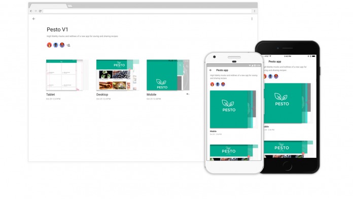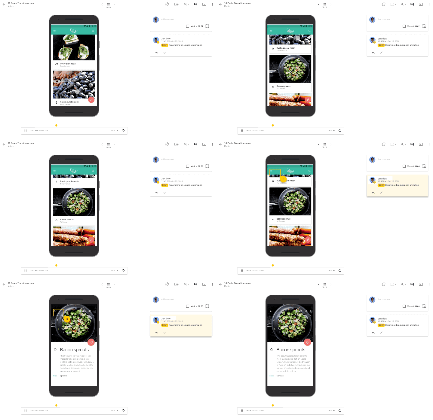
For app developers and designers, Google is now making it easier for you to collaborate and develop good looking apps – all out of Google’s Material Design philosophy. These will be in the form of a new suite of tools that expands the definition of how Material works, and educates developers and designers in how they can collaborate with these tools, even if you’re really not interested in the flat and minimalist way Google designs its apps.
Material Design was introduced in 2014 with Android Lollipop, and it was a rethinking of how apps should behave and look like on touchscreen-based devices. These tools have been around for a while, but new additions will give Material a more collaborative air. The new “Gallery” works like the way GitHub works, but only for designers. This set of tools makes it easier for people to upload, share, and comment on designs.
There is also the “Remixer,” a tool which allows developers to create prototypes of apps, and you can interact with them directly. This helps teams refine design specs by feedback, but the best thing is that the prototype is accessible and configurable from both inside and outside the app itself. Then there’s “Stage,” which gives developers more control on the prototyping process by allowing them to test out and demo interface movement in their apps earlier.

It’s mostly targeted for developers and designers, but it is a good thing. Designers and app makers can start playing around with their projects earlier, seeing how they will look and work faster, and get feedback from other designers faster as well. This can only mean good things for end users.
SOURCE: Google


