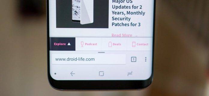
We’ve always been so used to having the address bar of our browsers at the top of the page, whether you’re on your mobile device or on your desktop. But for those who are using Chrome on their smartphone or tablet, you might want to brace yourself for an upcoming new change. In fact, it’s on the beta version already. When you update Chrome Beta, you will now find your address bar at the bottom of your browser by default.
It still basically looks the same, with the number of tabs open after the address bar and the three dots to bring you to the other menu items after that. This time however, you will find it at the bottom of the page. There are also new actions you can do, like half swipe up on the address bar to get to your website shortcuts. If you do a full wipe up, it will bring you a page where you can find link to stories you might be interested in.


Both of the swipe actions will also bring you a bottom menu for Home, Downloads, Bookmarks, and History. If you don’t want this new default address bar at the bottom, you can still opt out of it since you’re on the Chrome Beta version anyway. Go to chrome://flags then search for Chrome Home and then switch it from Default to Disabled.
No word yet of course if this will make it to the final build of the Chrome mobile app update. So far, its only rolling out to several users on the Chrome Beta, so there is probably not that much reaction yet about it. How about you? Is this a minor/major change that you’ll be welcoming or protesting about?
VIA: Droid Life


I went into flags and disabled it. I may send the bar back down there and tinker with it someday but right now I want it on top.
Nice, thanks for informing us ?
I’ve been on this experience for a few months now. You’ll hate it for the first few days but a week in you’ll turn a corner and start to like it. Now this swipe up interaction (for my recent sites) feels natural and satisfying. Try to stick with it.