For all those Twitter fans out there we have an awesome new Android client to share with you all. In case you haven’t heard of it, the extremely popular Carbon for Android Twitter app has finally been released. After being announced and teased last year and under development for far too long, it’s available now. The app is beautiful in every sense of the word and has one of the most elegant UI’s I’ve used lately, but read on to see our thoughts.
The makers claim it was under development for over a year, and the level of polish and smooth animations that this app offers surely makes us believe that claim. For those wanting a simple and smooth experience on Twitter that is different from the usual, yet easy to understand, Carbon for Android is certainly a good one to try. Sadly although the app is extremely impressive so far, this being the first public release it’s riddled with issues.
For one Carbon has plenty of features, but our biggest complaint by far is the lack of settings, or a real settings menu of any kind. Oh and there’s no tablet support. There’s tons of floating and curving animations that makes this one of the best Twitter apps I’ve ever used, but the UI animations are almost too extreme. They could cut back on those a little and I’d still be happy. Secondly, the impressive and beautiful layout isn’t as intuitive as you’d like. For those that use Twitter daily it’s easy to understand, but a new user won’t know what any buttons do and will have to guess.
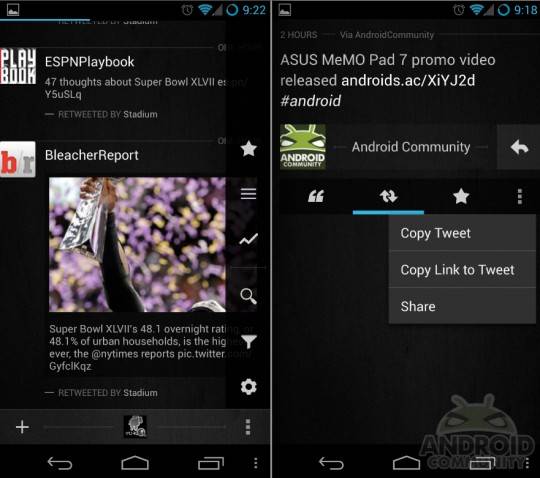
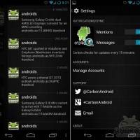
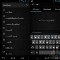
Above we mentioned the settings menu. And a quick tap of the on-screen menu button brings up a little sidebar offering settings, filters, search, trending, favorites and more. Sadly the settings option only has two settings for notifications. If you want to tweak colors, change notification sounds or even disable sounds but still get notified — you’ll have to wait for an update or use something else. If you want to disable in-stream images or change font size, that isn’t happening either. Sadly this is one of the best Twitter apps I’ve used to date, has tons of polish and looks great, but lacks the end features needed.
Once the developers add more options, Tweetlonger integration, and fix a few issues this will probably be our go-to Twitter client. For now though it just doesn’t quite offer everything we need. You can’t even select how often it checks for updates. It’s only 15 minutes and there’s no changing it. In time this should rock though.
Don’t take our word for it. This is by far one of the smoothest and prettiest apps we’ve seen lately, so give it a try yourself and see if it’s worth keeping installed. Get it from the link below, or check out the other clients listed as well.






Did you say updates? It took him a 6 months to release an app that was “100% complete” – and you’re expecting an update sometime soon?
haha you make a great point…
I was excited to see that this was finally available. I quickly went to the play store to get the app, only to find out that I can’t run it because my version of Android is too old. Side note… HTC was supposed to have upgraded it last August.