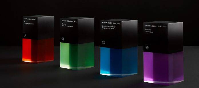
It’s only the third year that Google has been recognizing the best apps that use Material Design, but already they’re trying to shake things up with this year’s edition. They have now opened the nomination process to those who are probably one of the best to judge whether the design is not just looking good but also highly functional – the users. The Android community (not us, but maybe some of us) made their submissions and out of all the entries, Google chose four honorees under four categories: Brand Expressiveness for Blinkist, Interactive Design for Eventbrite Organizer, Platform Adaptiveness for NPR One, and Innovation for momondo.
Blinkist is an app/service that is kind of a CliffNotes for non-fiction books, giving you a 15-minute summary of the important points of the book, if you don’t have time to read the entire thing. Google has recognized their “engaging and harmonious use of iconography, motion, and especially typography.” The reading experience is not just easier for users but also engaging as well. Meanwhile, Eventbrite, which allows organizations and individuals to use the platform for their events, was appreciated for their “clear structure, navigation, and use of affordances.
NPR One, the app where you can listen to all the NPR podcasts, received an award for their multi-platform design. Whether you’re on your smartphone, tablet, smartwatch, car, or just at home, you get a seamless and consistent experience with your favorite podcasts and shows. momondo, a travel fare aggregator, and search engine is being recognized for its use of Material Design to still innovate their app, with its use of distinctive animations, beautiful imagery while loading and a useful but also beautifully designed interface.
The winners joined Google in the SPAN Pittsburgh conference, but they did not specify what else they’re going to win, aside from the prestige of being 1 of 4 awardees recognized.
SOURCE: Google


