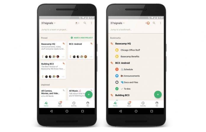
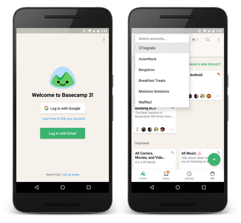
Just like the saying first impressions last, an app’s homescreen is just as important as it is the first interaction you get with the app, whether it’s new or an already familiar one. Productivity and collaboration service Basecamp 3 has decided to do a makeover with its homescreen, making it easier to understand, navigate, and use. The update also brings changes in the user interface, as well as added features, including faster switching between accounts.
Once you open your Basecamp 3, you’ll see that all your projects are now in cards. And in case you see a lot of cards because you have a lot of ongoing projects, then you can go to the “jump to a team or project section” and just type the first few letters or words from the title you’re looking for. You can also pin or bookmark those projects that are important to you and all the pinned ones are of course at the top and there’s an option to just see only those ones.
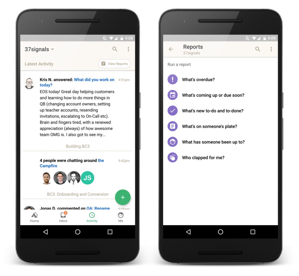
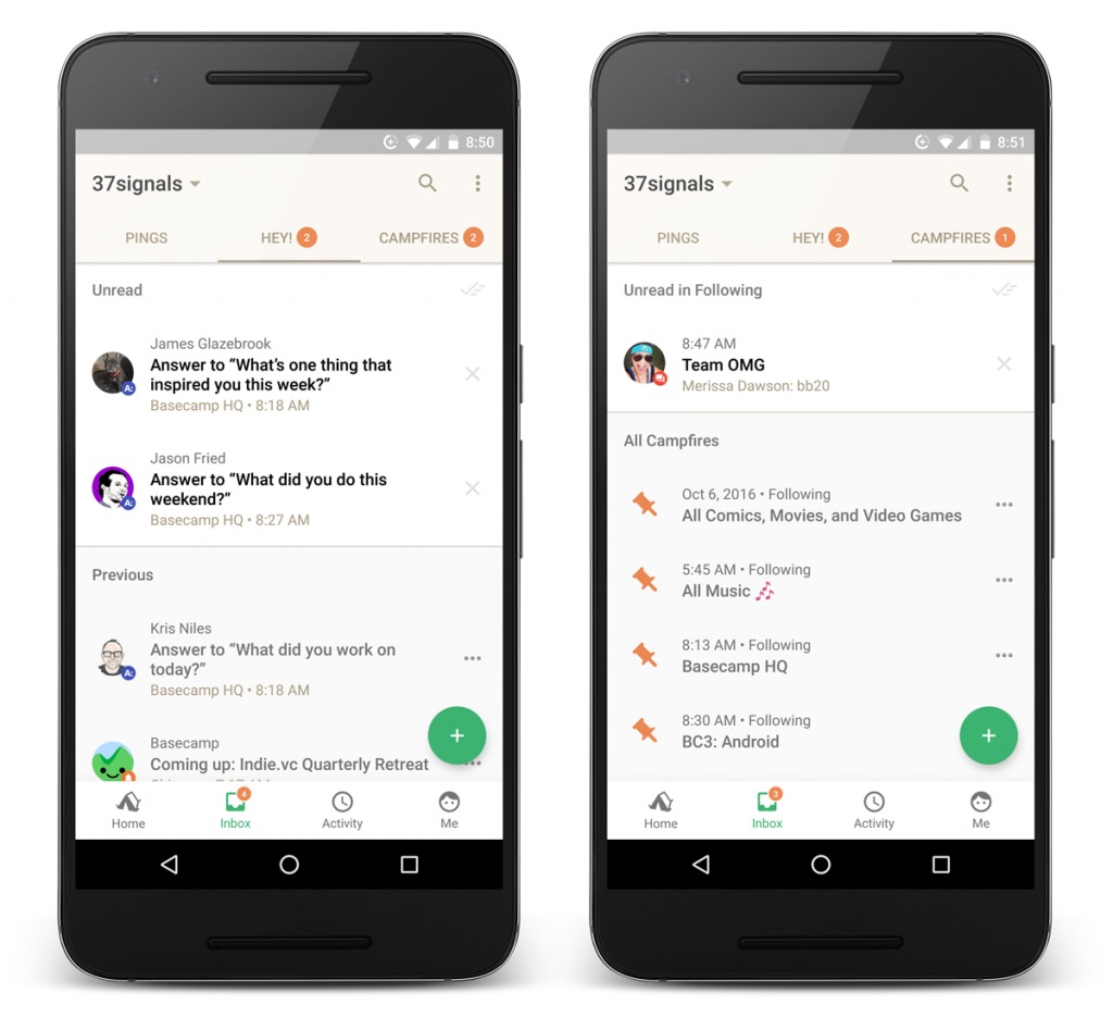
Next to the Home section is the Inbox where you’ll see all the Pings, Hey!, and Campfire notifications. Anytime you have something unread, you’ll see a badge on the Inbox and whatever section you need to pay attention to. Then you have the Activity section where you will be able to see all the latest activities in all your campfires, like messages, to-dos, comments, files shared, etc. The Me button next to Activities shows the things you’re actually involved in, like your to-dos and drafts. You can also manage your devices, profile, and notifications from here.
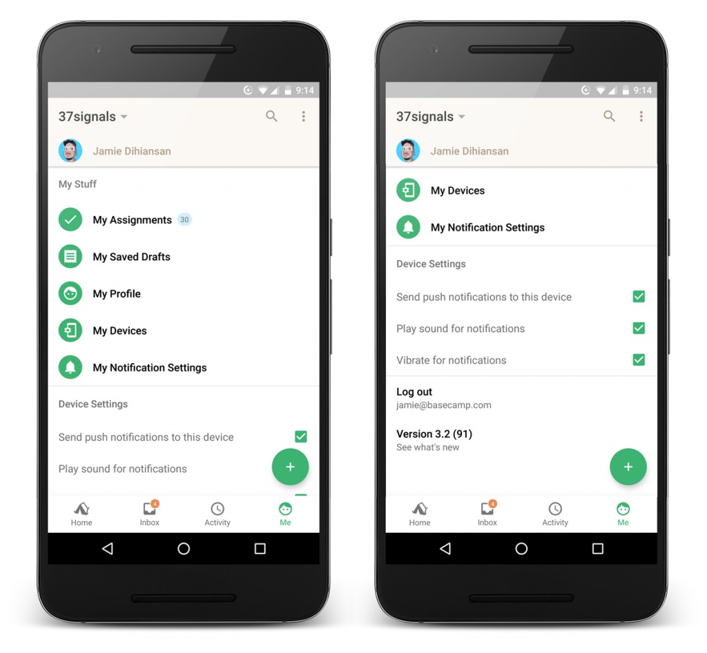
And if you have multiple accounts, you will now be able to switch between them faster from the title bar. You can update your Basecamp 3 from the Google Play page and enjoy this whole new home screen.
SOURCE: Basecamp 3


