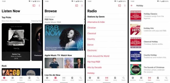
One Apple product that has worked well with Android devices is Apple Music. For those who prefer this music streaming service over Spotify, YouTube Music, etc, having it on their Android device is a boon. The latest update is now making the app even better as it comes with a redesign to make it similar to the iOS 14, at least theme-wise. The update also brings the autoplay feature so you will have a steady, continuous stream of music to listen to without having to control your app on your device.
The immediate new thing that you will notice is that the redesign brings you five primary sections in the menu bar. Listen Now is the new item you’ll see there and it replaces For You. Beside it, you’ll see the icons for Browse, Radio, Library, and Search. The Search function has moved down there as it previously was seen in the upper part of the app and was seen as a search bar. But now it’s down there where it’s easier to reach for those using their device with one hand.
The Now Playing view is also seeing a redesign. When you play a song, you get a dynamic background as the color adjusts to match the color scheme of the album cover. You’ll also see a new infinity-shaped icon on the right-hand side of Playing Next when you open the queue list. The icon will enable autoplay and will show you a preview of the songs that will play next. This means you won’t run out of songs to listen to even if your actual playlist has ended.
You’ll also now be able to share a song, album, or playlist whether you’re in the Search or Now Playing queue. If you share it on Instagram, Facebook, or Snapchat story directly, it will come out as a tappable sticker. If you share it on another app, it will just be a link to the selected song or album. You’ll also now be able to control the quality of streaming when you’re downloading on cellular.
The Apple Music for Android version 3.4 should already be rolling out to users according to 9 to 5 Google. Remember though, you need to be an actual subscriber ($9.99 per month) to use the app.


