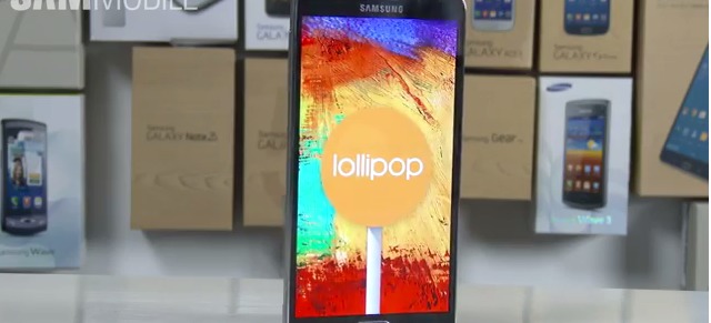
Not all smartphones are equal, especially when it comes to rolling out of major updates from Google. While some users are already enjoying their devices now running on Android 5.0 Lollipop, some of us have to wait for a little while longer. Good thing there are some very nice people out there who are generously showing us previews of how some gadgets will look like and will run on the update, and this time, it’s the turn of Samsung Galaxy Note 3.
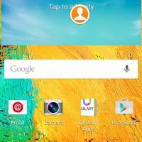
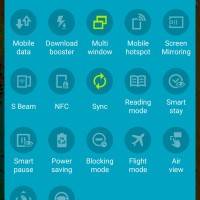
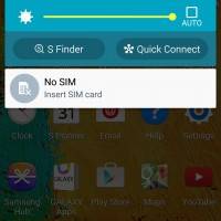
The previous flagship phablet will eventually get to be Lollipop-ized of course, but for now, if you’re excited to see what the effect will be on your device, let’s thank the guys from SAM Mobile for this one. Basically, it looks almost the same as the Lollipop on the Galaxy S4, complete with Samsung’s TouchWiz UI which they have been rolling out to all their devices as well. All the core green elements we’re used to seeing from Android have now been replaced by the Samsung Blue. The animations are also smoother, the font changes have also been applied, and it just seems to look better.
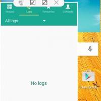
Another major change is that it now has the Multi-user window feature from the Galaxy Note 4, which will make those of you who are rabid multi-taskers (or maybe those who have digital ADD as well) really happy. Other Lollipop features that have already been much discussed, like changing the wallpaper, choosing widgets for the homescreen, the new notification system and of course the Material Design (with a Samsung twist) can be found here.
The one that the guys at SAM Mobile show in the video isn’t the final build of course, so expect a few differences when the Lollipop finally arrives on your Galaxy Note 3. There is still no official word as to when this will be, but as they say, patience is a virtue (and we know you want it right now).
VIA: SAM Mobile




Not even a single lag or stutter 😀