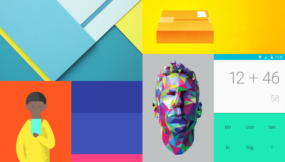
One word, or two, that has been thrown around a lot at Google I/O 2014 is “Material” or “Material Design”, which evokes images of blocks of color and the mention of paper. But what is it really as a design standard and how does it fit in with Android L and the rest of Google. We dig deep into Google‘s documents and videos to find out.
From Holo To Material: Fake to Real
One thing that will immediately stand out about Material design is the flatness. Android users will not be strangers to this type of flatness since it was introduced earlier via Android 4.4 KitKat. In a sense, Material standardizes and makes explicit the thinking behind that minimalist design. But Material isn’t just flat for the sake of flat. With Material design, Google is using a new metaphor in crafting user interfaces, that of paper. But why paper? Well, paper is flat and yet not totally so. It doesn’t have much thickness, but it has depth, and it has elevation. Paper is familiar. Paper is real. So for Android L and forward, Google is dropping the last traces of Holo, a name that evokes the word “holographic”, with something a bit real.
Well, that’s well and good for theory, but what does it all mean in practice?
Tactile Surfaces: Piles of Paper
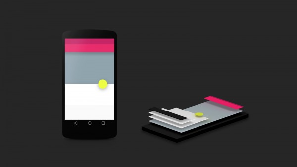
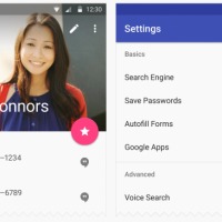
Using the paper, and ink, metaphor, Google has come up with a way to present clean layouts and interfaces. Windows, toolbars, buttons, all of these follow the behavior of sheets of paper. When put side by side, in what Google calls “seams”, two sheets of paper move together and proportionally. When one side or half shrinks or goes up, the other enlarges and goes up as well. The more interesting convention is “steps”, when sheets of paper are put on top of the other. Each component of the screen, whether it be a dialog window, a toolbar, or even a button, has an elevation level, with some layers beneath and others above. So while Material design adopts a seemingly flat-like minimalist aesthetic, in truth, it isn’t totally flat.
This can be best visually seen with the rather generous application of shadows. Like in real life paper,sheets above cast shadows below. And the higher a sheet is, the stronger and larger the shadow it casts on a sheet that stays on the same level. This gives the appearance, and feeling, of depth and a bit of realism without going overboard with the skeumorphic trend of the past. Quite interestingly, in this new design paradigm, most buttons on the interface don’t “sink” when you tap on them, unlike their more 3D counterparts. Instead, they get a “lift” instead.
Bold Graphic Design: Colors and Images Everywhere
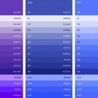
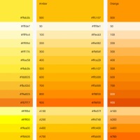
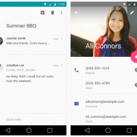
With a more minimalistic approach to design, attention has been shifted away from making things look “correctly 3D” to making them visually pleasing. For Google, this means using lots and lots of colors. And images, whether photographic or graphic. But it’s not just any set of colors. Google is introducing palettes of colors with varying shades to be used by apps. Of course, Google isn’t running a dictatorship (yet), so these really are more like guidelines and recommendations, but Google, and users presumably, hope that app developers would exercise common sense and good judgment. But to make that appeal to developers, Google is also simplifying the way developers can define colors. There are hooks for the most basic color roles, like a main color highlight and a secondary one. Google is also suggesting picking a consistent accent color for interactive visual elements like buttons, checkboxes, and sliders.
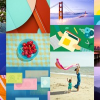
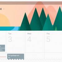
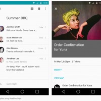
But it isn’t all about colors. Material Design encourages the tasteful but restrained use of images in user interfaces, at least in places where they do matter. Photo gallery apps are no-brainers, but calendars, travel apps, media players can all benefit from a slathering of pictures or clipart. Google makes recommendations of what types of images to use, advising to stay away from stock photos, overloaded illustrations, and excessively manipulated images. One hard part about the design guidelines is making sure that images are able to scale to different screen sizes and that text laid out on top remain legible.
Meaningful Motion: Graceful Like a Dancer
One aspect of user interface design that is both underrated and at the same time abused is animation. Ever since mobile devices gained the ability to display fluid motion, some have taken them to the extreme, even in user interfaces. There are still those that hold that animations like sliding sheets and whatnot are excessive and unnecessary, but Google believes they are key to putting the user in control of the interface. In particular, animations help users understand which parts can be moved and by how much. Especially using this paper and ink metaphor, interface elements can have their own mass, weight, and therefore animation properties.
But more importantly, animations give users immediate feedback, to let them know what is going, even the fact that there is actually something going on. As Google says, animations bridge the gap between a user’s finger and the interface beneath the glass. Motion can also subtly guide the user’s attention to appropriate parts of the interface. The key point to Google’s philosophy about animation is “subtle but clear”.
Little Bits and Pieces …
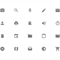
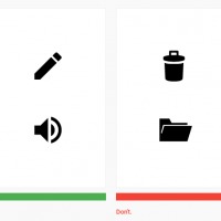
There are, of course, other bits of the interface that are not exactly covered by those sweeping major arcs of Material Design. Icons, for example. In particular, system icons, like those used for delete, edit, copy, paste, etc. These are reduced to even more minimal forms than previous iterations. While previous icons are also “flat” in design, they aren’t particularly flat in perspective and still give of a slightly 3D feel. The use of rounded rectangles are encourage, of course only when they do apply.
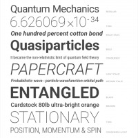
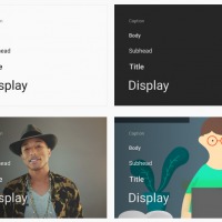
Fonts are probably one aspect that hasn’t change much since Roboto was introduced in Android 4.0 Ice Cream Sandwich. Google isn’t switching out fonts yet, but it did shower some love and attention to perfecting the font. That said, Material Design does give a bit more emphasis on typography, making recommendations on the size, weight, line height, and even contrast used depending on context. Bottom line is that every element, even text, spacing, and margin, are thoughtfully placed and not haphazardly slapped on.
… That Make Up the Whole
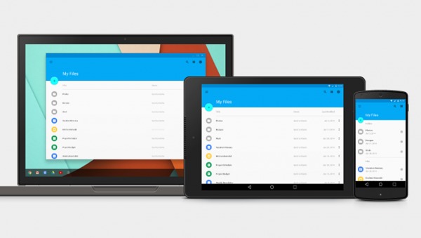
One last interesting part of Material Design is that this isn’t just for Android this time. Material Design is something that Google intends to implement across all its products, across all Android incarnations and devices. This means Chrome OS, Chromebooks, Chromecast, Android Auto, Android TV, Android Wear, Gmail, and more. This will be Google’s unifying visual image across its presence on the Web, devices, and cars. But Material Design isn’t simply a set of rules to be followed or even guidelines to be kept in mind. Google calls it a living document, one that it intends to update and improve along the way. This isn’t just how Android L will look like. This is how Google will look like.
SOURCE: Google (1), (2)
VIA: SlashGear







Personally, I think most of the color palettes they’ve shown us so far look like sh**.
Slate blue and grey? OK, that looks good.
But then they toss in a radioactive green? No thx.
Purple, fleshy pink, grey, and yellow? In what world is that a pleasing color palette?
yeah the colors are a bit “out there”…probably some gay guys on the design team. Only explanation
I would like it to and a black … I love black I hate white..