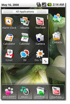
It is always exciting to see what concepts and revisions current phones went through before they were released into the wild. Although it is a very rare occasion, one company that had a chance to work on an Android interface is showing one of their works of art on their website.
Tat is a Swedish software technology and design company that enhances the experience of users mobile devices. They have brought the “WOW” effect to over 240 million mobile devices worldwide. Tat proudly shows their latest concept demos including a demo for Google’s Android in their Show Room. We are still unsure if Tat had anything to do with the current Android design and layout, but it is sure fun to imagine.
In this demo we see much of what we do now in the Current version of the Android operating system. A few tweaks here and there make the layout seem familiar to even iPhone owners, the “dock” at the bottom of the screen too closely resembles that of the iPhone. We want to know what our members think, is this real? Do you think Google should have gone with a interface more like this one?


