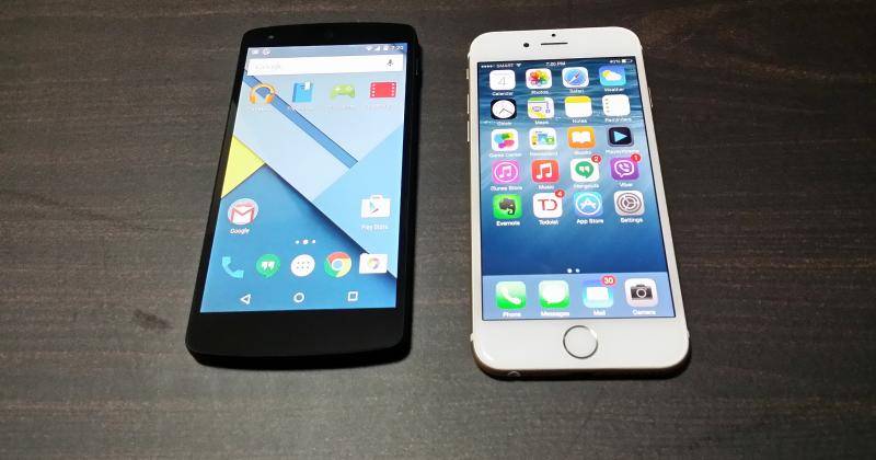
We all love Android here, right? Right? But let’s face it. Even if we have a soft spot for the little green guy, we could be considered blind fools if we believed that Android were 100% perfect. A minor nitpick here, a pet peeve there, Android doesn’t have all the answers. Sometimes, it gets the answers wrong. And sometimes, the ones with the right answers are its competitors. Here we take another look at the eternal rivalry between Android and iOS, but with a slightly different twist. This time we try to see some of the things that iOS, particularly iOS 8, may have gotten right.
At this point, iOS fans will surely have a lot to say, but let’s whittle down our list to some very common ones. In particular, we’re going to inspect the user experience that the shiny new iOS 8 has to offer. We will take a break from the usual app store battles or the open source wars and look at the things that users might immediately notice.
A notification drawer that works
Let’s start with something immediately contentious: notifications. Some love being beeped for every thing that happens in their mobile universe, others despise it. While iOS definitely lets you have control over those (more on that later), there is already one immediately visible advantage to Apple’s implementation of the common notification system: groups. Notifications from the same app are grouped together. No, they are not lumped in a single notification entry, but exist as individual items that you can act on as you desire. Or you can clear out all notifications from the same app all at once.
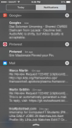
Here, you might begin to notice one flaw that iOS 8’s implementation does have that Android does better: clearing all of them. And by all, we mean all, regardless of app or group. Unfortunately, Android only has that one button and it could probably do better with a proper grouping mechanism. But given the new Material Design language, it might be hard to pull it off visually.
No better day than Today
One cannot look at the notification drawer without looking at its sibling. iOS 8 adds a Today tab to that drawer. It is the home of your date, weather, and many more, and it’s more than just visual eye candy. For one, it avoids lumping everything together with notifications, like how Android does it by default (other OEMs may have a thing or two to say). For another, it really gives meaning to what “Today” means. It can house various widgets, like calendars, reminders, todo lists, and whatnot. It can even have shortcuts to, say, Evernote actions and, for reasons that escape the mind, Dungeon Hunter. It becomes a one-stop shop for the information and shortcuts you need at a glance to keep your day in control.
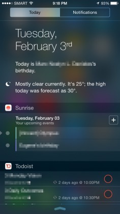
“Big deal!”, you say. “Android has had homescreen widgets for an eternity.” And that is definitely true. But the iOS 8 Today tab has one thing over Android’s myriad homescreen widgets: ubiquity. You can summon Today from within any app, without leaving said app. You can quickly create a note, glance at your schedule, check off a todo item, right from where you stand, sometimes without batting an eyelash. On Android, at the very least you have to press a key or button to go home, and then you have to be sure you’re in the right homescreen page in the first place, breaking your flow.
Swipe your problems away
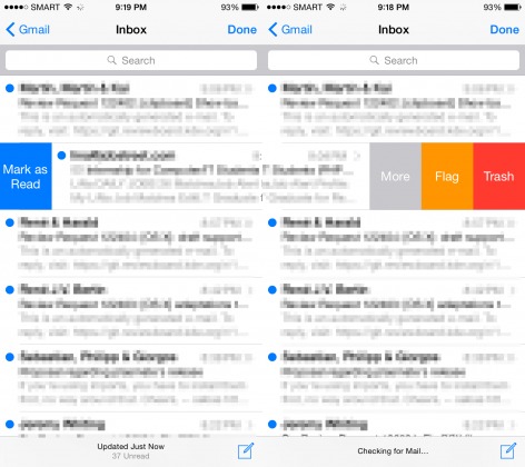
Speaking of flows, iOS does have one very smooth almost universal gesture that even Google seems to have subtly acknowledged: swiping items. Perhaps the idea can be traced back to the Clear list app, for iOS of course, that capitalized on this gesture. Some apps on Android, even Google’s own Gmail and Inbox apps, also use it now. You simply swipe an item left or right to act on that item. One direction may delete it, another direction may archive it. Sometimes, more actions can be revealed by slowly swiping the item instead of a fast gesture. it takes a bit of getting used to and may require a bit of muscle control, but it feels so much smoother than a “tap and hold” gesture that brings up extra menus, similar to a mouse right-click. Not to mention it’s fun too! And that contributes to strong habit formation.
Controls when they matter
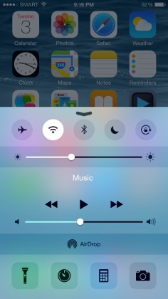
iOS 8 has a Control Center panel that can be configured to appear anywhere when you swipe up. This panel has your basic toggles for Airplane mode, WiFi, Blueooth, etc. It even has shortcuts for camera, torch, alarm, and calculator. And like the Today panel, it unburdens the notification drawer by relocating the media controls inside of it instead.
Yes, Android already has something similar, but there are subtle differences that make the iOS 8 version somewhat better, though not substantially so. And here, we have to take into account Android version differences. In fact, to some extent, Android 5.0 Lollipop has significantly changed the implementation, some better, some worse. Previously, you could get to these Quick Toggles by swiping down with two fingers from the top of the screen. With Android 5.0’s unified notification drawer, however, everything is now located in a single place. But rather than clutter the screen all at one, Android hides the toggles initially, requiring you to swipe down again to reveal them. That’s two swipes instead of one.
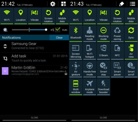
This is also an area where OEMs and custom ROMs might have done better. Samsung, for example, puts a Quick Toggle row at the top of its unified notification panel. It definitely saves space while still giving users access to their most used toggles. Others put the toggles on a separate tab beside the notification, akin to the Today/Notifications setup of iOS 8. And custom ROMs and some OEMs allow users to choose which Quick Toggles are immediately visible.
Wrap-up
These are just some of the things that iOS 8 does seem to do better than Android, at least for now.
But we wouldn’t really be Android Community if we left it at that right? In Part 2 of this series, we’re going to take a look at how Android can fix some of those, though not all. And that is all thanks to these wonderful things we call “Apps”.


Wow iOS fanboy much
Samsung fucks android
Real Android is not Samsung !
It looks really old fashioned and falling further behind all the time with other Android ‘skins’
The real Android system from China
You can still do two finger swipe down to get to toggles in Android 5.0. i guess if you actually used the OS much you’d have known that. Touchwiz is garbage, imho.
I’d love a comparison to Windows 10 when it shows up.
shut up @abdouhamza:disqus
so apple steals these features and they do it better? noooooo
android 5.0 has solve most of those “issues”
To begin with im in ios hater!
But comon honestly,u call that better? Redeculios stuff. And most of ios 8 is old Android copy… still years behind and no costimization on there tv remote controls refering to iphones
You could very easily replicate “Today” in Android with a notification widget connected to google calendar. There is nothing stopping Android from doing that. Ditto with the control shortcuts…several apps already do that. Battery Widget Reborn has one built in. It is every bit as fast and ubiquitous as iOS’s. I can get to the notification bar from any screen.
And frankly, all these “well, there are a few things iOS still does good” articles (and not just on your site) seem a little condescending to Apple. As if you are grasping at straws to prove iOS is not completely worthless or obsolete.
This is the worst pile of shit article. You don’t talk about Android 5.0, you have a pic of a Nexus 5 but show pictures of Touchwiz. This article is a fail, just take it down.
android 5.0 wins flawlessly
Lolipop rocks… Here information are inappropriate
If You Need Extra Money Averaging 50 bucks to 300 bucks daily for Freelancing from Your home for few hrs a day then try this