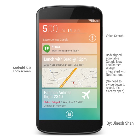
The wait and anticipation for the next version of Android right from Google has been a long one. After initially expecting it to debut at Google I/O last month only to be denied any such details, we’re all left wondering what they have in store, and when. While Android 4.3 Jelly Bean is the next version we’ll see, likely this month, some truly amazing fan UI concepts have us craving that Key Lime Pie.
When we say fan-made UI concepts, we mean these aren’t real, official from Google, or anything of that sort. Instead this is one designers “conceptual design” and dream of what Android 5.0 Key Lime Pie could and should look like. And it’s freaking amazing. Google needs to hire this guy immediately. Before Apple or someone else does.
A talented designer by the name of Jinesh Shah posted these over on Google+, and it has many wondering what exactly Google has planned for Android 5.0 KLP. Because something like this would be refreshing. He posted a few last week, but yesterday revealed his Android 5.0 Concept part 2, and we’re getting a deeper look at what he imagines Android 5 to look like.
click to enlarge
The design can only be described as beautiful, minimal, and exceptionally clean. He’s done a great job blending Android 4.2 Jelly Bean with the card-style we’ve been seeing from Google Now and other Mountain View apps. Everything is smooth, and detailed with enough to completely be a daily driver. The lockscreen has been overhauled with even more information than ever before, widgets have been improved, and the entire UI on the top is different too. With the clock and signal indicators coming from the top-down, which makes sense given how we usually interact with the pulldown bar.
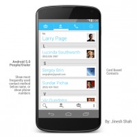
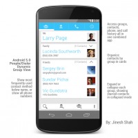
Another idea that we’re a huge fan of is changing the contacts and People app, as that’s a mess currently. I’m really liking the simple and clean idea he’s came up with, as well as the groups. Lastly, the idea of having expandable widgets is genius. Just like how we enjoy expandable and more informative notifications in Jelly Bean, he’s making the widgets be expandable in a way you can gesture by sliding up to “hide” the widget. Why waste screen real-estate if you’re not using it. Genius! Someone bake this into a ROM like CyanogenMod ASAP please.
Again, this is just one graphic designers concept designs and dreams of what Android could be, and we figured you’d all love to take a look. While Jelly Bean should be getting updated soon, these give us even more hope and have us dreaming for the future with Android Key Lime Pie.



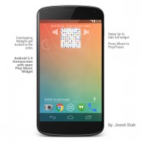
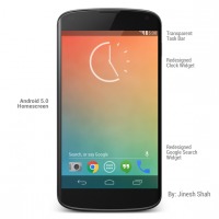
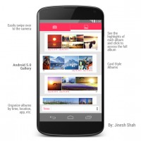




Looks rather cartoonish.
Said the liar.
i hope Google Now becomes a center-point of the OS. Thats such great software
I would really like it if the camera was like that on 5.0
The lockscreen was the only good thing about these pictures, other than that, the rest are not the way Google should/would or will go. Android 5.0 i believe will be a redesign of Android, being that Android has basically looked the same since ice creams sandwich.
You don’t like the idea of having expandable widgets. Just like expandable notifications? I think that’s an awesome idea. Completely
I quite like it. In terms of relating it to existing home screen features I’m picturing something similar to the current iOS folders implementation; grey out the other homescreen items and shunt them off screen as the widget expands, giving you a mini view of the app behind the widget without needing a full launch of an app.
looks good
This would be able to be done with a few apps/roms. Someone get on this.
love how he gave himself a fake gf named Erica…lol
lol or a friend brad..
The expandable widgets are a horrible idea from an UX perspective.
With the exception of the silly upside-down reception icon, the rest looks mostly okay; but way too white/light for my taste. Google has admittedly been favoring Holo light over Dark very much in its recent apps updates – but I’m still hoping they’ll introduce light/dark style as a user preference at some point.
I’m sure most old-school Nokias (pre smart phone era) had it that way up with a transmitter logo next to it.
A form of expandable widgets were already introduced by Action Launcher. Swipe up from an icon on the home screen (or in a folder) and the widget appears, vanishing again when you’re done. So you can have benefit of the widget whilst only sacrificing the space of the icon.
wallpaper made by Jony Ive
It should also have an NSA update checkbox so we all know when they have read our stuff….that would be so awesome….
Is it me or most of these concept photos kinda suck? In usability and design sense
Same with the iOS 7, Just hope this isn’t the future, because Android just looks awesome as it is!
Well i think that is just stupid evvery thing should change and if this is any rhing to go by it will be fricking amizing
ios 7 is ugly but doing a drastic change was smart, because the way they did it kept the function the same so people don’t have to relearn.
I think Key Lime Pie needs to do a similar change keep the functions the same but make the OS look even Better, stock is good but it could look better.
I understand your argument though because unlike iOS we can customize it to look how we want so them changing the look drastically is really necessary but it would still be a nice change if done right.
These honestly look pretty terrible. Google would never push something that looked like this. It’s piss-poor design, visually and interaction-wise. Hoping 5.0 is more of a refresh than a continuation of the now-dated Holo styling.
agreed stock android still looks good but i think a major refresh is much needed.
I use android but I have to give apple credit even though I think ios 7 is ugly (especially the icons…yuck) they changed ios 7 enough that ifans feel like their getting something new and fresh without changing the function so that people do not have to relearn the OS completely.
I don’t see why google cannot do a drastic change because unlike ios if someone doesn’t like it they can simply customize the crap out of their phone until their is no sign of Stock Android’s Look and Feel.
Only thing I don’t like is the overlapping widget thing. Other than that, I wouldn’t even rice my phone if KLP looked anything like this. Just as minimal as it should be.
no just no….anyone can do this with nova launcher, they need to do something substantial like apple is with iOS 7 (even though it’s ugly)
Now even though i think apple’s ios 7 looks ugly they at least changed everything from the look to the animations but was able to keep it similar enough that people will not have to relearn everything. I think KLP needs to have that same kind of change.
Keep it similar enough so we don’t have to relearn but I would do a major change, because even if people don’t like it they can still root or customize their device with launchers, theme’s and icon packages, but I trust google enough that they could make it look good.
currently running a Google Play Edition Rom on my Black GS4, waiting for the Nexus 5 to make the jump to all Nexus Based devices, nothing beats stock.
Android4Life