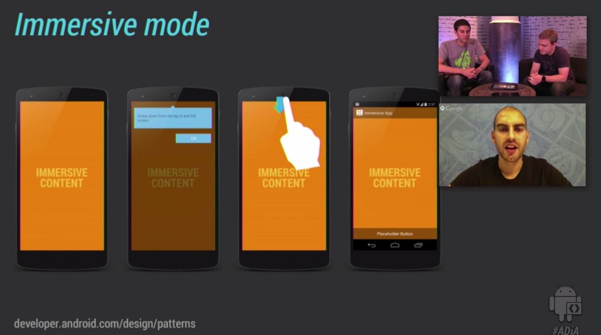
If you’re into design, especially in regard to android OS design choices, tho one’s for you. The Android team has released a pretty comprehensive video about their design choices with Android 4.4. In it, you’ll see just what makes the UI tick, and gain a lot of insight on how the OS is put together.
Again, this is not for the feint of heart. The team delves into subjects like which colors they used for branding, as well as the icon changes we all knew were coming. Even such finite choices as the opaqueness of buttons when idle and selected are discussed. for the average consumer, probably not so interesting.
For the real geeks out there, this is really amazing content. Understanding the changes will also help us understand how our apps work, or more importantly — should work, moving forward. By understanding the design on a root level, we get a better idea of just what Android is going for, and what they hope to achieve both internally, and in collusion with developers.
From icon dpi to why immersive mode is so important moving forward with Android 4.4, this video has it all. We found it tirelessly entertaining and interesting, so we encourage you to check it out. If nothing else, you’ll understand how to best take advantage of Android 4.4, either for development or day-to-day enjoyment.


Why did Google do NO public unveiling of the Nexus 5 and NO public unveil of KitKat – why are we forced to google to find videos on the new phone and new OS – why did Google “ignore” KitKat and the Nexus 5?? It makes no sense!
They didn’t either with Nexus4.
It was unintentional, because of the hurricane Sandy.
But I guess it helped them figure out something… What? I’m not sure.
And honestly I don’t care.
Those videos are clear and direct to the point.
Why would I want a video where I cannot see the device as well and have to hear “amazing” “revolutionary” “exceptional” every two seconds.
One Google IO keynote a year is enough.
Because they were selling more than they could make before.