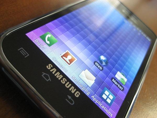
Android Police have unboxed the Samsung Vibrant, and they’ve even managed to compare it to the Samsung Captivate. Another device in the Galaxy S lineage, launching on AT&T. As we are all already aware, there are many similarities between both devices. They both have a 4-inch Super AMOLED display, and mostly the same specifications. But, in the end, the Vibrant seems more complete and solid than the Captivate, according to the folks behind the unboxing.
After all of the similarities, let’s move onto the differences. First off, the packaging. The Vibrant has more variation in their design, while the Captivate is pretty generic. The Vibrant also ships with a microSD, but the Captivate does not. The Vibrant comes with pre-loaded with a few applications (The Sims 3, Amazon’s Kindle software, and Slacker radio) and a complete copy of James Cameron’s AVATAR movie. What’s very odd, though, is the fact that AP points out there are odd, and somewhat random software tweaks and differences between the handsets. Lastly, and perhaps most importantly, the Vibrant allows third party application installs. But, the Captivate does not. So it looks like AT&T’s not backing down on that subject at all.
There also different in the physical build quality. The Captivate is more plastic-y while the Vibrant is more solid. Also, the Vibrant battery cover is smooth and glossy plastic, but the Captivate’s is a matte battery cover that feels like a fake metallic. The Vibrant is a little bit lighter than the Captivate as well. The front design of the Vibrant looks similar to the first generation, while in our opinion the Captivate looks like a BlackBerry Storm 2 at first glance. So, if you’ve got a choice, which one are you going for? The Vibrant or Captivate?
[via AndroidPolice]


