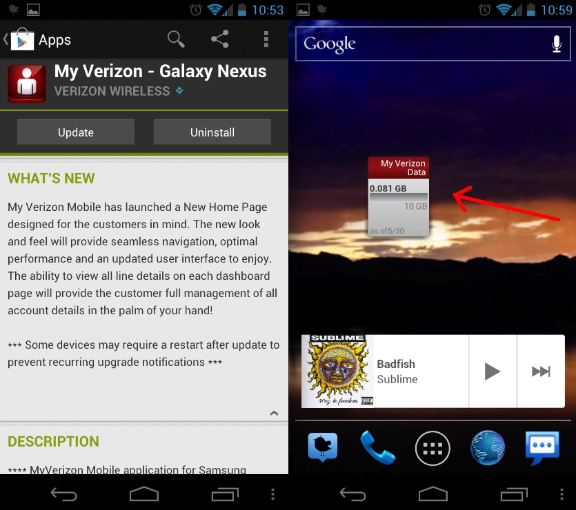
Today Verizon has just issued an update for their popular My Verizon App. The version here for my Galaxy Nexus was just updated this morning and claims to have some impressive new UI features (that I’m not seeing) but does manage to bring a new widget reminder along with it. If you’ve ever used My Verizon you’d know it’s the easiest way to check data and minute usage, as well as pay your monthly bill.
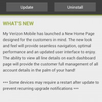
The update available right now in the Google Play Store mentioned a brand new overhauled UI, especially the home page. Verizon details it as an easy to use interface for seamless navigation, optimal performance, and a user interface customers can enjoy. Mine looks exactly the same and still feels like it was made in 2008, but that’s just me. Did the update change the UI for you?
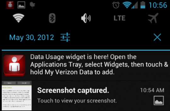
The other main change, shown above, is the fact that Verizon has added a notification to their app that allows users to now place a small 1×1 widget on their homescreen that will display their data usage. This is new to me and although data isn’t something I worry about too much, I can see many others loving this option especially if they didn’t know it was there. You might want the widget once Verizon takes away your unlimited data this summer, and I’m still waiting for a minutes widget too. Get the update today from the Google Play Store.




Oh how nice of Verizon to provide us a Data Usage Widget. Especially after they let us know that they are going to CUT the grandfathered Unlimited plans LOL
Yep, very nice, specially if I can open it (not) after 8 hours of using of my Galaxy Nexus because the battery dies!
Is this what has been holding up the Android 4.0.4 update?
The data usage widget isn’t new. We’ve had it all along. Duh!! Pay attention people.
There will be no 4.0.4 update. Isn’t that clear by now? Maybe 5.0 will work on this hunk-o-junk?
If this is the kind of crap that was holding up the update, I’m going to go kick the entire Verizon dev department in the balls.
I finally got my update i live in Las Vegas NV and did the services update trick like 2 times and it worked FINALLY