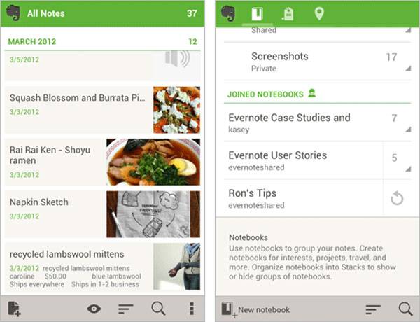
This week ,a href=”http://blog.evernote.com/2012/05/15/the-all-new-evernote-4-0-for-android/”>Evernote 4.0 for Android debuted, and the update brings with it some slick new features the users of the app will appreciate. Version 4.0 for Android has been completely redesigned and promises more than just a new look. The company says that this is the most powerful version of Evernote for Android ever.
Every screen in the app has been redesigned to make it easier to use and to be faster and more intuitive. The home screen is changed combining note creation options with buttons that take users directly to notebooks, tags, and places. Notebook lists have been improved to make it easier to browse and find what you’re looking for. The action bar on the bottom of the app screen has also been tweaked and has options specifically relating to the screen the user is viewing.
The app now supports swipe navigation with horizontal swiping allowing app navigation by moving between categories. On devices with location services enabled, Evernote will also assign a place to each note you make. Another key change is the user name of the person using the app is now the top left corner of the screen. Touching the username lets the user get their remaining monthly allowance and access to more settings. The company also promises other changes, check out the video to get a better idea of how the updated app works.


my roomate’s step-sister makes $76 an hur on the computer. She has been out of a job for 7 months but last month her pay was $18384 just working on the computer for a few hours. Read more on this site ⇛⇛⇛⇛► http://hirebestfreelancer.blogspot.com