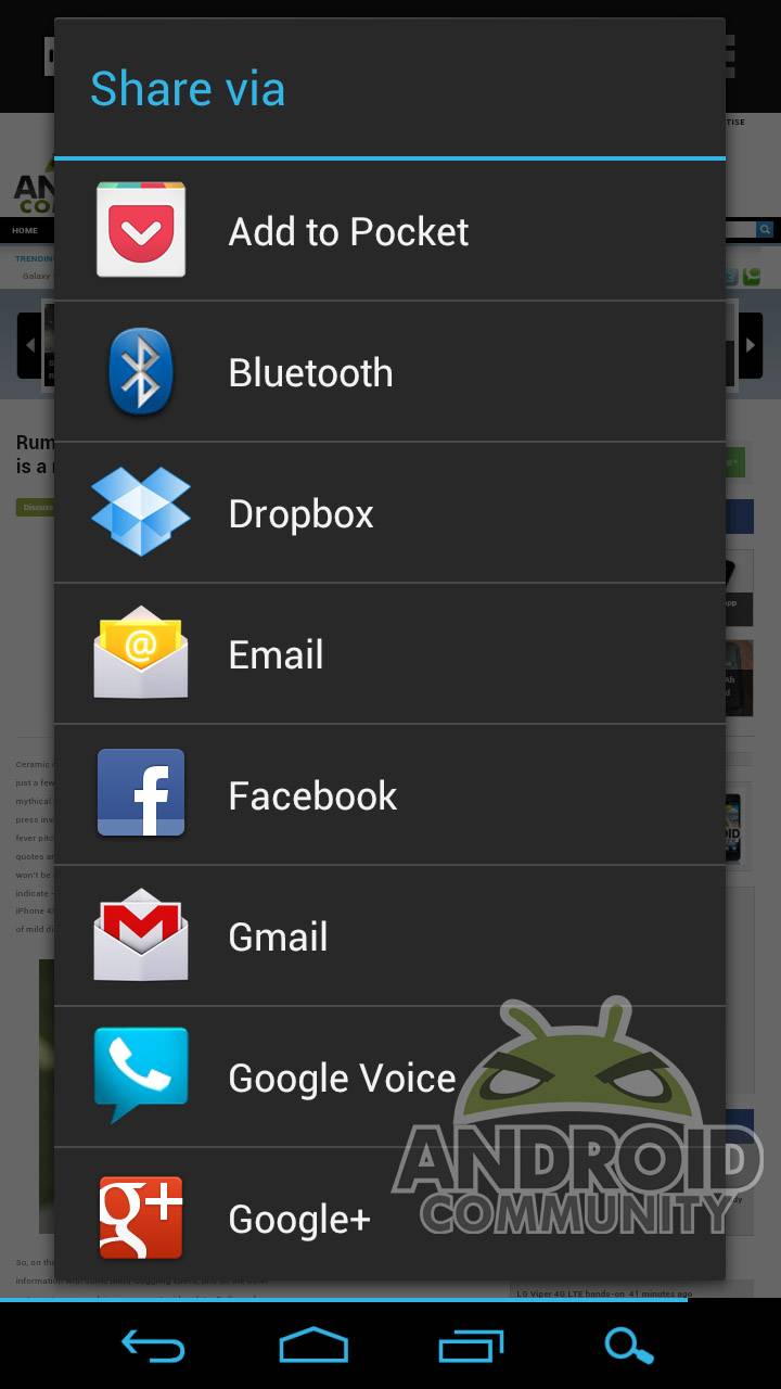
If you’re a hardcore web user, odds are pretty good that you’ve got some way of managing your content so that articles, images and videos that are interesting, but not pressing, are saved for later. Android has a lot of options for this, but one of the most popular has been Read It Later, a bookmarking and sharing service that’s gained millions of users over the last few years. Today Read It Later becomes Pocket, and with the branding identity change comes a brand new (and free!) app for Android. We took a look around the new Pocket to see how it stacked up to Read It Later.
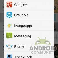
What I immediately noticed is that Pocket’s new interface embraces Android 4.0, with icons and menu placement that seamlessly blend in with my Galaxy Nexus’ native Ice Cream Sandwich. This is still a rare sight among major Android apps, and even rarer for those publishers who have a significant iOS presence, like Read It Later-Pocket. Setting up a new account for the demonstration and saving my first few items was seamless on Android. I found myself saving directly from the Android browser.

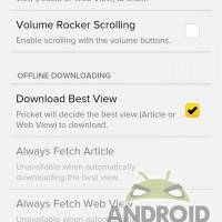
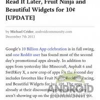
Synced items are a little slow, sometimes requiring a refresh to see immediately. This isn’t a major issue, since most of the time you’ll be saving them and forgetting about them until later. All of the essential Read It Later functions remain intact: by default, the app saves a mobile-friendly version of a webpage or photo to view at a later date. Quickly going into airplane mode didn’t affect it at all – a welcome fact for someone who often loses 3G signal. The formatting itself is admirably clear with a Web View that can be accessed at any time, and if you prefer to save sites in a full desktop view that’s an option.
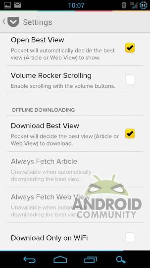
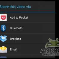
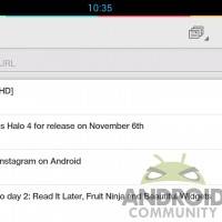
Sharing and managing from Pocket is also commendably easy. Long-press an item to bring up an ICS-style menu that lets you tag, favorite or delete an item, as well as mark items read or re-share it. You can filter a long list by content (web, photo or video) tag or parent URL. Once an item is marked as read, it disappears from your primary list, but you can still find it via the search function. I really can’t say how refreshing it is to see the interface so well-done on an Android app – Facebook could learn a thing or two here.
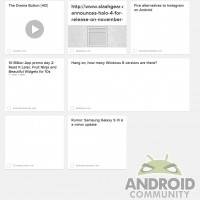
Overall the improvements from Read It Later to Pocket are impressive. The only thing that’s a bit of a let-down is the desktop web integration, now located at getpocket.com. The default tile view dynamically changes size, and on my account at least, the thumbnails wouldn’t appear, making the reading experience somewhat less seamless than the Android app. But overall it’s a refreshing change for a service that millions rely on. If you often find yourself switching between devices and missing content, you’ll want to give Pocket a try.




The update is very nice, even though the new name is much less recognizable than it used to be. Also, they need a dark theme that is easier on the eyes in dark environments.
Edit: night mode in the reading view takes care of reading in the dark.