The idea of reading periodicals on a tablet-like device is in fact older than the current crop of tablets. But the reality has thus far left something to be desired, mostly because translating an essentially analog experience to the digital world is a major UI feat. Dealing with content that seamlessly integrates text and photos is a lot more difficult than simple words. The latest company to have a go is Next Issue Media, and they’ve got some of the biggest magazine publishers in the US behind them: Hearst, Meredith, News Corp, Time Inc and Condé Nast. The format and pricing of the Next Issue service present a compelling front, so we decided it deserved a full review.
Content
There’s a lot to see in Next Issue, and depending upon your personal tastes, you may want all of it or just a little. At present there’s 32 magazines on offer with up-to-date issues, and back issues stretching to the beginning of 2012. Highlights include Time, Sports Illustrated, People, Fortune, Entertainment Weekly, Popular Mechanics, and many more. For a full list of titles, check out the Next Issue Google Play Store page. There’s a lot to be had here, though I must say it skews female at the moment – not that that’s necessarily a bad thing. Next Issue representatives say they’re continually working to add new magazines.
Odds are pretty good that there’s something in Next Issue that you want to read, but the question is, what and how often? While the service retains the ability to buy single issues and subscriptions (between $2 and $10 a pop) the real draw will be the “all you can eat” unlimited plans. The Basic plan gets you all the monthly magazines, included at $9.99 a month. The Unlimited Premium plan adds weekly magazines (Entertainment Weekly, People, Sports Illustrated, The New Yorker and Time) for $14.99, granting you access to about three dozen full magazines with four months of backlog (at the moment). That’s hundreds and hundreds of issues a year for less than $200.
But there’s a bit of a wrench in the works for these unlimited plans. Some magazines only format their content for certain Android tablet screen sizes and resolutions. Better Homes and Gardens, Car and Driver and Elle are only available on 10-inch tablets, while Time and The New Yorker are only available on 7-inch tablets. This seems to be determined by screen resolution rather than actual devices, using 1024×600 as the 7-inch standard and 1280×800 as the 10-inch. So for example, if you use a Samsung Galaxy Tab 7.7, you’ll get access to the 10-inch exclusive magazines but you won’t be able to access the 7-inch ones. It’s an annoying limitation to be sure.
Interface
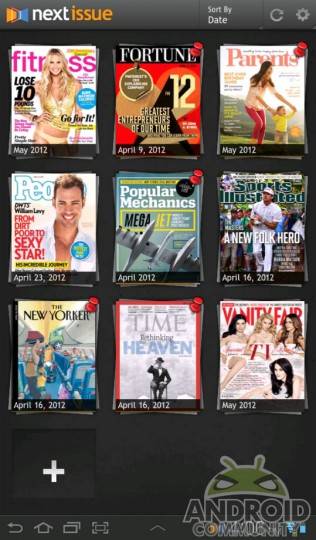
What sets Next Issue apart from other apps and services is the fact that all of the magazines on offer have been reformatted specifically from the source files. There’s no pinching and zooming here: it’s as if you’re reading a periodical designed exclusively for the tablet format. The magazines themselves are wrapped in an interface that’s heavy on the visual flair but retains a surprising amount of utility. Magazines are separated into “stacks” of dated issues, and you can download and read each issue one at a time, or get them automatically synced with your device. If you use one of the unlimited plans, you add magazines to the front page of your app in a format that’s similar to the Kindle archive method.
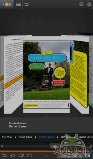
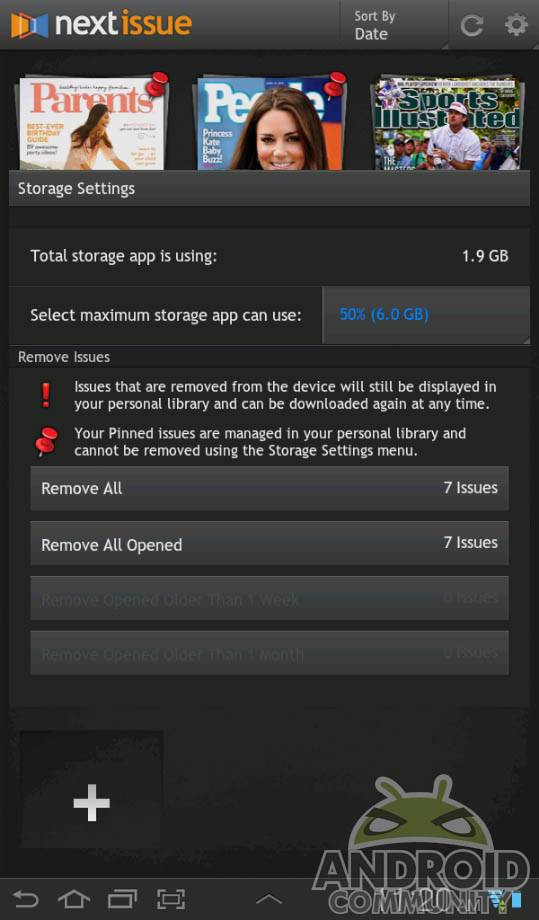
Managing space and downloads is important, since each magazine is several hundred megabytes of rich media. If you tap on a magazine that you haven’t read before, it automatically begins downloading from the cover. This is a little slow on my 3G connection, but on 4G or WiFi, you shouldn’t see any problems. You can zoom to any page in the magazine at any time and have it load up automatically – a very nice touch. The Settings menu allows you to set which magazines are automatically delivered, how long a downloaded magazine will stay on your device, and which ones won’t be automatically deleted. The only management option that’s missing is SD card support, but that’s coming in a future update. Navigating individual magazines is done via a combination of article headlines and a CoverFlow-style viewer.
The periodicals themselves are surprisingly easy to read. Each and every bit of text has been specifically formatted for the screen size and resolution, making for an experience that’s much more comfortable even than web browsing on a tablet. In-line linked content like Contents pages flow dynamically, and though they shift from one periodical to another, it’s easy enough to get the hang of things. If you’re someone who seriously reads any of the available magazines “for the articles”, you’ll be a happy camper.

Pictures are another matter. Because most of these magazines are delivered in a portrait-only format, you’re limited on how much and how often you can view photos. Some magazines allow for a “blown up” view of specific images, but they’re still stuck in the portrait format, squeezing down to fit in the viewer pane. (If you’re a fan of men’s interest magazines, get used to seeing only half a centerfold at one time.) Most videos suffer from this tiny viewer problem as well. This rigid adherence to a single resolution and a lack of natural tools, like orientations switching and pinch-to-zoom on large photos, really drags the experience down.
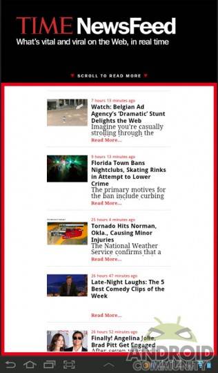
Dynamic content is interesting. You get the expected contextual links, but some magazines also throw in extra content that’s only available on the app. One surprising and pleasing example was a cover of Parents Magazine, which had an animated cover of rain that gradually faded away to sub-headlines linking directly to articles. Ads are present, of course, but the vast majority of them are just static images and a link – there’s been almost no effort to make them fit into the digital format.
Value
If you’re a regular reader of the weekly magazines on offer, the $14.99 Unlimited Premium plan is a steal. Likewise if you pick up more than three or four of the standard magazines every month, $9.99 is a solid price for the content. If you’ve subscribed to any of the magazines on offer, you may or may not be eligable for a discount on the backlog of titles – some even let you access all of the titles for free if you’ve already subscribed. And in a move that’s definetely consumer-friendly, you can cancel Unlimited plans any time.
Of course, these scenarios assume that you’ve already got an Android tablet running Honeycomb or later. And since not all titles are available on all tablets, even on Android, you’ll have to take a serious look at which ones you can access to determine if the service is worth it. If Next Media can add even more titles (and presumably keep the same price) it will continue to become more valuable, a la Hulu Plus or Netflix. Next Issue is not available on smartphones of any size.
Wrap-Up
Next Issue doesn’t replace the experience of a paper magazine, but it comes as close as I’ve seen yet to doing so, and presents some impressive value-ads at the same time. If your coffee table is littered with months of People back-issues, you cold swap them out for your tablet and actually have room for your coffee. Likewise the idea of having hundreds of issues in your bag or purse, in a format that’s actually enjoyable to use, is compelling.
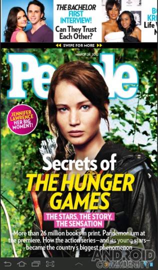
Is it worth it? It depends on what you read, and how often. The reader who picks up Popular Mechanics twice a year probably won’t see a serious benefit with Next Issue, but if you’ve got a box of ten years of Vanity Fair back issues, you’ll definitely want to give it a try. In either case, you can access the entire catalog on your Android tablet free for 30 days before paying. If you’ve got an Android tablet and you’re an avid periodical reader, it’s definitely worth a try.
Check out a video hands-on below:


You’ll definitely want to give it a try. In either case, you can access
the entire catalog on your Android tablet free for 30 days before
paying. If you’ve got an Android tablet and you’re an avid periodical
reader, it’s definitely worth a try.