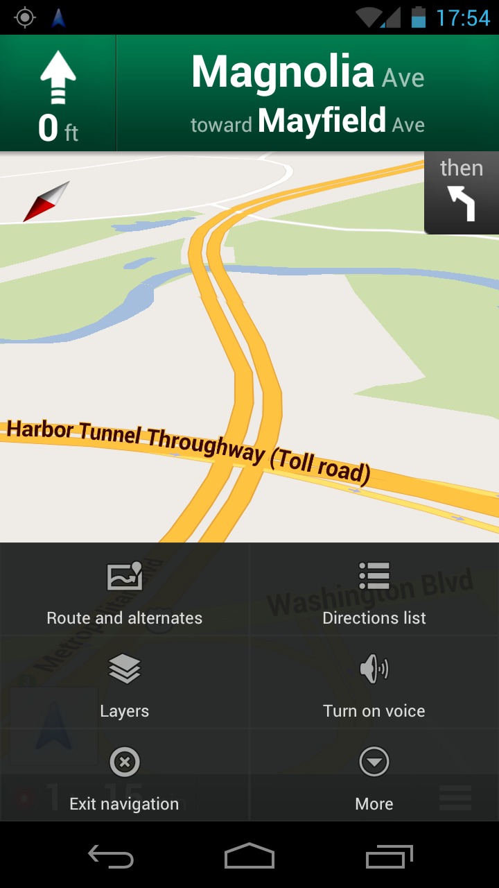
Though not a large update, Google went ahead and refreshed the UI for the Navigation menu within their Google Maps application. The ICS menu button has been taken out completely, and replaced with a much larger (easier to press) menu layout right above the ICS soft keys. After using it, you’ll notice it feels much like the previous versions of Google Maps before Android 4.0.
When using the Galaxy Nexus on the road, despite the massive 4.65″ display – it was still hard to maneuver through the previous menu list and tap the intended buttons. This change obviously occured for safety concerns, and the larger buttons really do help when driving. Personally, I always place my smartphone in a dock once sitting in my car, so reading the tiny print is hard enough.
Hopefully we see more grid-type layouts throughout Google applications; they are easier to press than the lists.You can update to the latest version here, and considering its small size it should only take a second – literally if downloading over 4G LTE. Small changes such as this are why I love Android; the OS conforms to its users rather than its users conforming to the OS.
[via Phandroid]


