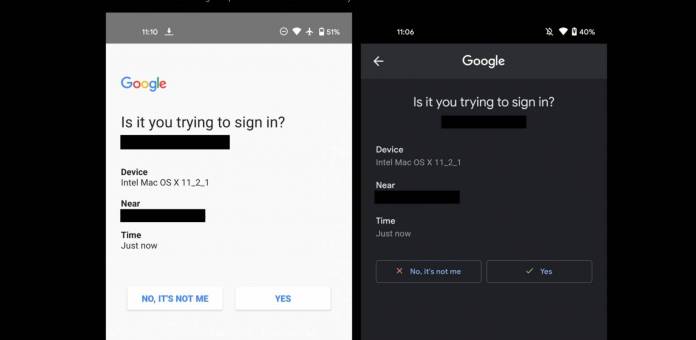
A lot of casual Internet users probably do not use two-factor authentication when signing in to apps and websites. But it is probably one of the best ways you can protect yourself and your accounts right now. Google Prompt is probably one of the best ones you can use right now, aside from actual security keys. The latest update to this service brings a much-needed dark theme as well as improvements in the user interface and readability of the prompt.
9 to 5 Google shares the improvements that arrived with the latest update. The changes in Google Prompt were actually spotted back in 2019 but has since then undergone several tweaks. And now finally we are getting the stable version of the updated app. The most noticeable is that you now have a dark theme option which lessens the strain on the eyes that an all-white background brings.
Aside from the dark theme, we also get readability and usability improvements. The main components of the prompt is now centered unlike the previous version which is to the left. So you now have the Google logo, the “Is it you trying to sign in?” question, and your email address front and center. Underneath you still have the Device details, the location details, and the time when you’re trying to sign in, but it’s still left-aligned. Having them not grouped all together is a small thing but it improves readability.
The other improvement is in the response part of the prompt. “No, it’s not me” comes with a red x mark while “Yes” has a blue checkmark with it. They’re also both not in all-caps anymore and follow the Material Theme outline style. Again, it’s not a major change but it is a nice visual improvement over the previous UI. And both changes go well with the dark theme option if you decide to use it.
The updated Google Prompt is still rolling out to users but doesn’t seem to be available for everybody just yet. It seems to be live on a lot of personal accounts already but not on Workspace accounts just yet.


