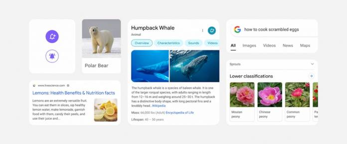
As we all know by now, Google loves to tinker around with its various products, particularly when it comes to design and visual elements. Soon you’ll be able to see a new look for the mobile search app as a visual redesign is set to roll out. The aim basically us to “let the search results shine” so people will be able to focus on the information they’re looking for. But if you’re expecting a drastic new look, it’s really more of tweaking of the elements for it to look more “Googley”.
Google designer Aileen Cheng shared a sort-of behind-the-scenes look at this latest Google Search mobile app redesign. First of all, you will see that your search results will be using larger and bolder text, even making the result and section titles bigger. This is to help the human eye to “scan and understand Search results faster”. They will also be using more of Google’s own font which they have been using in Android and Gmail and other Google products.
You’ll also be getting a new “edge-to-edge results design” which basically means less shadows and more visual space to let the results have more “breathing room”. And while the clean background will remain, they will also use a bit of color to help guide your eyes to the more important information but not to the point that it will overwhelm the visuals. The design will also have a bit more roundness to it, similar to the Google logo.
The redesign will probably be not as obvious to the unobersvant eye. But now that we know what changes will happen, we can pay attention to these once the update rolls out. But of course, what really matters to those who are using the mobile search is the speed of getting search results so these design elements will probably not matter or at least not be noticed readily as long as you get what you came for.
Google said this visual redesign of the Google Search mobile app will be rolling out in the coming days. No specific time period has been mentioned so just wait until you get an update.


