The Google Nest Hub Max was said to get a revamped interface. A hands-on video even surfaced so we pretty have an idea about the new look and feel. It has already received a number of improvements in the past months including group calls and meetings, as well as, the ability to determine proximity. We’re looking forward to that easier interface for senior citizens and more improvements to the Google Assistant. Hopefully, the new interface will present more on-device controls, actionable cars, and a tabbed UI.
We have yet to confirm everything we know but now we’re learning a new dark mode will be available. It can be assumed this won’t just be ready for the Nest Hub Max but also for other smart displays. The next update is also said to bring a new tap-and-hold gesture among the many other improvements.
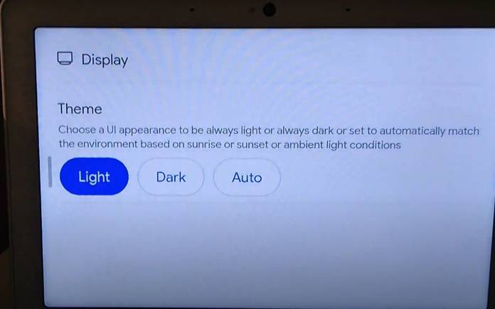
The dark theme is there as shown by the “Turn on dark them” card. It can be seen on the “Discover” tab which may also be accessed directly from the Hub’s settings. When you choose the card, you can see three more theme options from Light, Dark, and Auto. The Auto theme appears to match the environment based on sunrise or sunset or ambient light conditions” as described.
The system already offers low-light mode or Ambient EQ but an automatic dark mode may be appreciated. You don’t have to change the setting because the Nest Hub Max will know what to do. View the updated Smart Display below:
Google is expected to roll out the update very soon. There is no related announcement yet but it is something we can get excited about. Let’s wait and see.


