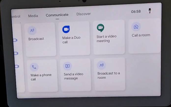
The Nest Hub system is getting an update. There is no official announcement yet but a quick video of the new interface on Google Nest Hub Max has surfaced on YouTube. We haven’t featured the Nest Hub line recently except when Netflix was made available for streaming on both the Nest Hub and Nest Hub Max last July. We know a Google Nest Audio will be ready soon as per several leaks. When it comes to the interface, the last update we mentioned was the improved multi-room control for supported devices.
Today, we get a glimpse of the new interface as shared by Jan Boromeusz on YouTube. Touch controls seem easier to access. The UI has been revamped completely so don’t be surprised if an update is released in the coming days–or not.
The smart home control shows new contextual panels that look easier on the eyes. The UI looks simple with minimal touch targets. It seems Google wants to promote voice interaction courtesy of the Google Assistant.
The control is for the smart home, communication, and media among the major functions of the Nest Hub. When you tap on the screen, the panels will come up. Swipe through them to look for a function or app you want to use.
The revamp looks real but there is no confirmation yet if Google will release it on a wider scale. It could just be an experiment. But then we think the Nest Hub UI already needs a redesign. This looks neat so let’s wait and see.


