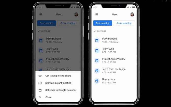
Google Meet may not still be at par with the video conferencing leader Zoom and some people may still be annoyed with that tab on the Gmail app, but Google seems to still want to make Meet really happen. It has gained a bit of momentum as it’s still a free app you can use for meetings and conference calls. Now they are redesigning the user interface of the dedicated mobile app to match that of the “meeting experience in the Gmail app.”
The existing Google Meet app actually opens to your front-facing camera which might be a little jarring for most people. You also get a bottom sheet with New meeting and Meeting Code. When you slide up, you’ll see all your video calls that are scheduled in your Google Calendar. When Google initially added Meet on the Gmail web and mobile app, the difference with the user interface was a bit obvious.
Now Google is going for a more “unified experience” with this latest redesign. When you open the app, you immediately get your “My meetings” list. There’s a “New meeting” button and a “Join a meeting” one. The former gives you three options: Get joining info to share, start an instant meeting, or schedule in Google Calendar. The “Join a meeting” button isn’t really explained but we assume that you can join through a link with a passcode.
Because Google Meet is still free for now, usage of the video conferencing app has gone up. Some prefer it’s a cleaner and simpler interface than the more complicated but still more popular Zoom. Feature parity is something they still have to work on as there are still several things that users prefer to use with Zoom which Meets doesn’t have. We also don’t know if they’ll be expanding free use beyond October.
The revamp of the Google Meet for mobile app is rolling out now for G Suite and personal accounts. However, it has only started rolling out for iOS and for Android, they just mentioned it’s “coming soon” with no specific timetable when this will happen.


