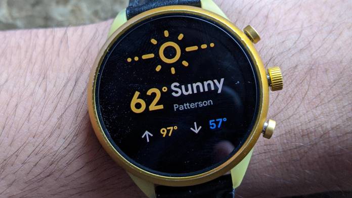
When you swipe from right to left on a smartwatch running Wear OS, you can get to tiles that provide a quick update on the weather, news, events, fitness, heart rate, and more. Now Google is kind of revamping the weather tile – the fresh design is more exciting, uses the premium of the screen to full advantage, and is already receiving mixed reactions from users. The new tile interface shows temperature, weather condition, and two-hour prediction just below it. The information is still sourced from Weather.com.
According to Redditors – the image of the tile was first spotted on Reddit; this is likely an A/B test by Google – they do it often to see how people react to a particular perspective feature. This is chiefly done to ensure if something goes wrong, the feature doesn’t end up ruining everyone’s devices.
The revamped Weather tile for Wear OS uses a combination of two bright colors and relatively big numerals – that are easy to read. The display shows the current weather condition (sunny/cloudy) on the top of the screen as a bright yellow icon. It is followed by temperature (again in yellow) and the condition in greyish text. Just below the text of the weather condition you can find the user’s current location.
At the bottom of the screen is the high and low temperatures indicated in yellow and blue. As informed, the forecast and condition is sourced from Weather.com. Users can tap on the new tile to open the full app for more detailed weather report. Some Redditors have informed that they are beginning to receive the new Wear OS tile – we haven’t tried ourselves yet.


