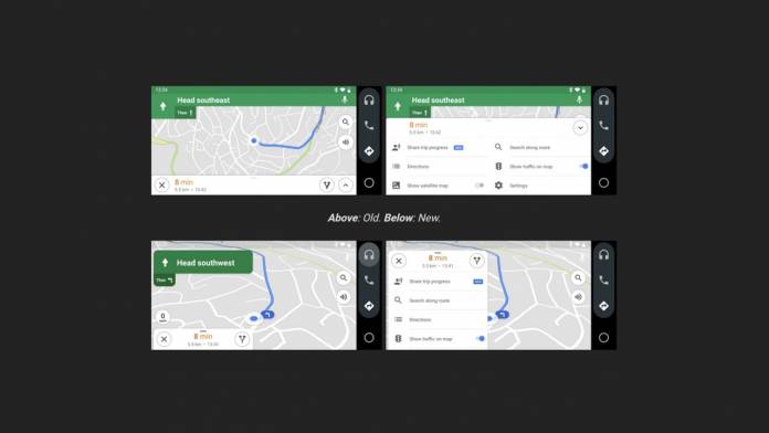
New update to the Google maps brings some noticeable changes to the interface when used via the Android Auto app. The latest Google Maps update – version 10.45 – brings a more visually pleasing UI with the modern design language that Google has adopted for its products. The changes bring a more rounded and floating menu box design for Google Maps when you open it on the Android Auto app on smartphones. In a way, the look is reminiscent of the Maps app on Auto head units, thereby enhancing the Android Auto’s UI.
New changes to the interface are more evident in the landscape mode which has been designed keeping usability in mind. The maximum screen area is kept for the map interface even when the menu options pop-up. For example, the direction banners are now floating type instead of the earlier ones which took entire space on the screen.
In the earlier version, the menu and sidebar showing the time to destination sandwiched the screen with very little visible map area. Now, they have been redesigned as floating banners. The overall design has also been bumped-up as the green color is darker now and the corners are rounded. When noticed closely, the text alignment has also been fine-tuned in this version.
This is a mindful update by Google even though most of the people prefer to use the native Google Maps on their phones for navigation or to connect the device to the car’s head unit which is Android Auto compatible. Will this prompt the users to now use maps on their phone’s Android Auto interface? It remains to be seen.


