If you have been hearing marketeers shoving ‘snackable content’ down your throat – like what Buzzfeed does to our taste buds, then Quibi is the perfect antidote to the perception of what bite-size content should be. As a platform that hosts bite-sized video content that is 10-minutes long, Quibi has hit the sweet spot that adheres to the millennial attention-span, when on the go. A ten-minute coffee break? A five-minute loo visit, or the train ride back home from work/school; revolving around short, original programming, Quibi can be downloaded on the iPhone and Android.
With your smartphone at the core of its functionality, Quibi is the lone ranger in this category. Major players like Amazon and Netflix, allow you to experience its content on TV via the TV app, but Quibi can be viewed only on your phone. An ad-free version sets you back by $7.99, however, those of you willing to fork out $4.99 can avail the ‘with ads’ option. Like I mentioned before, each episode in the Series of your choice is, by design, 10 minutes or less. For those who don’t know it, Jeffrey Katzenberg and Meg Whitman are the folks behind this project. The launch could not have been better timed, given the lockdown situation in most countries.
Quibi on your phone
We all are used to viewing our content in landscape mode, and herein lies the biggest differentiator with Quibi. The app allows you to view your content in portrait mode as well. Perhaps this is the reason why there is no tablet-optimized version of the app. I have been watching some of the series in this mode, and I have to admit that it is far more satisfying to watch a video in the portrait mode than the landscape mode.
What I love about this app is that each presentation mode is optimized to a T. For example, when you flip from the portrait mode to the landscape mode, you will notice how the angles or shots are optimized and even the text and credits get aligned to the mode they are being viewed in. The creative process has factored in this aspect and is quite seamless.
The nomenclature for this feature is ‘Turnstyle’, which Quibi is very proud of. I guess it stems more from the ergonomics of a phone. It’s far easier for you to carry your phone in portrait orientation, than in landscape, and if there ease and convenience, with no loss or cropping of frames – just like how you do a video call – then there is no reason why we should not adopt this new behavior introduced to us. Using the clock, sensors, and GPS built-into smartphones, Quibi uses the Turnstyle to its advantage.
Let’s Get started
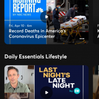
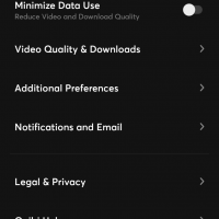
As soon as you download the app and register, you get greeted by the ‘For You Tab’, with one of the featured series on the top. Scrolling is more like flicking or swiping up a vertical deck of cards. The motion is something like you do in Flipboard. The only difference is that Quibi has a subtle haptic vibration feedback that makes a very soft click sound, giving you the impression that you have click-swiped an image up the deck. Stay on an image tad bit longer, and the preview video of the series starts playing. Details like the show’s title and metadata are easily readable on the vertical card interface. By the way, you can turn off the ‘vibration on touch’ for the scrolling via Additional Preferences, but in my opinion, you should leave it on.
Getting started is pretty easy, simply click the card or click on the three dots located at the bottom of the screen. You can browse for shows and episodes, download and follow your favorites, from the menu located at the bottom of the screen. You can browse through genres, New releases, daily essentials like lifestyle and news. If you are confused as to where to begin, then my recommendation is to start from the Trending pile.
Functionalities, like tracking the latest episodes or getting notifications when the new ones are uploaded, are mandatory, so it’s a given that this is a part of the roll-out. Basic controls like play, pause, rewind, and fast-forward are included as the on-screen controls. In the portrait mode, the progress bar is positioned to the right side as a vertical bar – much akin to a sand timer, the time runs out to the bottom of the screen. For those who are left-handed, Quibi has you covered, as you can switch to the left-hand mode in the settings.
In the landscape mode, the app runs like most platforms, the only thing is that you can double-tap intuitively to either side of the screen and either fast-forward or go back 10-seconds. In a few quick moves, you can mute the episode and switch to subtitles as well. Simply press and hold on the display and just slide up. What is very interesting in terms of technicalities is that Quibi dishes out two video streams in one go and seamlessly plays them, this helps the Turnstyle to switch easily from portrait to landscape mode and vice versa.
Tech Details You Need to Know
– Big phones like Galaxy S20 Ultra may not display end-to-end frames.
– Works with a single profile, no family options. Meant for individual consumption
– Easily digestible episodes.
– Quibi stands for ‘Quick Bites’.
– By default, the streaming quality is set at ‘Auto’.
– The quality can go up to FHD, and there is a ‘Standard Quality’ available as well.
What I like about the platform is the uber premium looks, ability to cater to a generation that is forever multitasking and has a low attention span. Buffering and using the app was effortless. The content quality so far is average. However, I do want to see how this will adapt to a tablet. Perhaps it will lose its essence and USP of ‘Turnstyle’.


