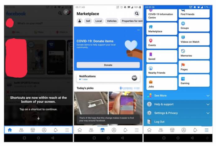
Some people woke up, opened their Facebook on their mobile devices, and got confused and surprised with what they saw on their Android app. That’s because the social network giant seems to have started a wider rollout of the new look of their app, with the tabs now located at the bottom of their screen. We previously saw some beta tests of this new UI before but a server side update is seeing more people getting the new look, for better or for worse.
The new Facebook UI is meant to make it easier to use the app even with just one hand. This is especially important for large screen devices where you sometimes have to do some “finger gymnastics” as XDA Developers put it. And if you don’t have the use of both hands for one reason or another, having the tabs at the bottom would make it easier for you to navigate through the app. It’s a small but pretty useful change.
What you’ll see on the bottom bar are the following: home icon on the leftmost part, People, Profile, Notifications, and then the three-line icon where you’ll be taken to the tabbed news feed and settings, among other things. In some cases, the Marketplace tab also appears or some who enabled the Dating feature may also see the heart icon. It’s not such a major change that you’ll get disoriented since the icons have been there before, just up there.
When you first open your app and the changes are already implemented, you’ll get a notification explaining that the shortcuts are now “within reach at the bottom of the screen”. You’ll be asked to tap on one of the shortcuts to continue and then you’re good to go.
Some users reported seeing the new UI and then a few minutes later, their Facebook app reverted to the previous look. This may just be a wider test or there were some errors in their initial rollout. We’ll just have to wait on Facebook for their official announcement or just wait for the update to eventually reach you.


