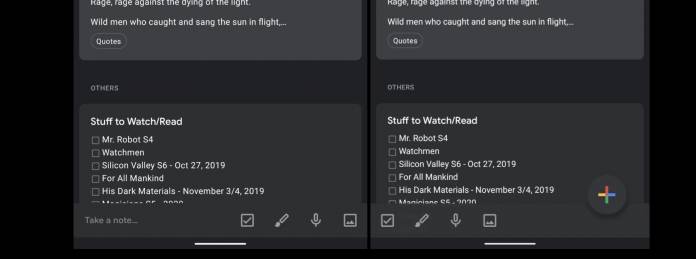
If you find Google Keep useful in saving your quick notes and to-do lists, you’ll like this new update rolling out to users. It’s not a major change but it is a useful one as the Material Theme update brings the FAB (Floating Action Button) to the mobile app and re-arranges some of the icons on the bottom bar. The app does not need any major updates anyway, just a few tweaks here and there to make it even easier to use especially when you’re on the go.
9 to 5 Google tells us about this minor but important tweak which brings the famous FAB element which we see in Gmail, Calendar, and other Google productivity apps. You will now see it on the lower right corner of the app, which is where the shortcuts for new list, drawing, audio recording, and adding an image, used to be. They have now been moved to the left side, replacing the “Take a note” field. Now things are more visual and easier to use.
The button is partially transparent, with a curve out, and remains docked even as you scroll through your notes. Having no text at the bottom also increases the space in between the actions so that it doesn’t look so cramped. The FAB usually serves as a shortcut to create a new item, like with Gmail it goes directly to the Compose window while Calendar lets you choose to add Reminders, Events, etc.
With the FAB in Keep now, it will directly bring you to a new note, effectively replacing the previous “take a note” field. Now the app has been effectively modernized as earlier this year we saw the dark theme roll out to it too. We’ll probably see a few more minor tweaks over the nex few weeks as it will reportedly get a universal Assistant integration and audio uploads on its web version.
The server-side update is now rolling out to users but it might take a while before it gets to everyone. You just have to wait for version 5.19.451.03.40 to get to you so you can enjoy the FAB.


