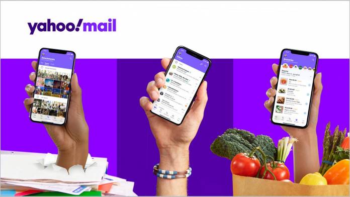
In case you didn’t know it yet, Yahoo Mail is still alive and kicking and is in fact under new ownership with Verizon. And it looks like the U.S. carrier isn’t giving up on it yet and has still been updating it with new features. The latest one is trying to make people see email differently than Google. The latter has put emphasis on search, understandably, but now Yahoo Mail wants you to think “views” rather than search when it comes to sorting out all your emails.
Their blog post has a title that states “reimagines the inbox of the future” and it looks like they’re trying to find what makes them different from Gmail and the other more popular email clients in the market today. And because we receive tons of emails every day, both for work and for personal reasons, what users want is to be able to sort through the clutter. Verizon believes it can help you do that with different views to help you find what you need, or even the things you didn’t think you needed but are there nonetheless.
One of the views that you can use is showing you the photos or files that someone sent you. Sometimes you forget the title or content of the email but you need the attachments and so now you can see in one place all your important files, travel documents, event tickets, photos, etc that have been sent through email. You also have a view for subscriptions so you can see all those newsletters and deals you signed up for and then quickly unsubscribe if you don’t find them useful, without having to leave the app.
They are also three views you can use when it comes to coupons, deals, and savings. The Deals View will look for all the coupons in your inbox and then notify you about the most valuable ones and the ones that are about to expire. The Grocery View will let you see all the discounts available through your loyalty cards at participating grocery stores. Location View has a built-in location map so you can see the deals nearest you but unfortunately, this one is only for iOS right now.
The Yahoo Mail app also has undergone a design refresh to fit one-hand usage. The navigation bar is now at the bottom of the screen and users can tailor fit their inbox with custom colors and themes, as well as choose which type of push notifications they want to receive. If you want to give Yahoo Mail a try again, now is the time to check it out.


