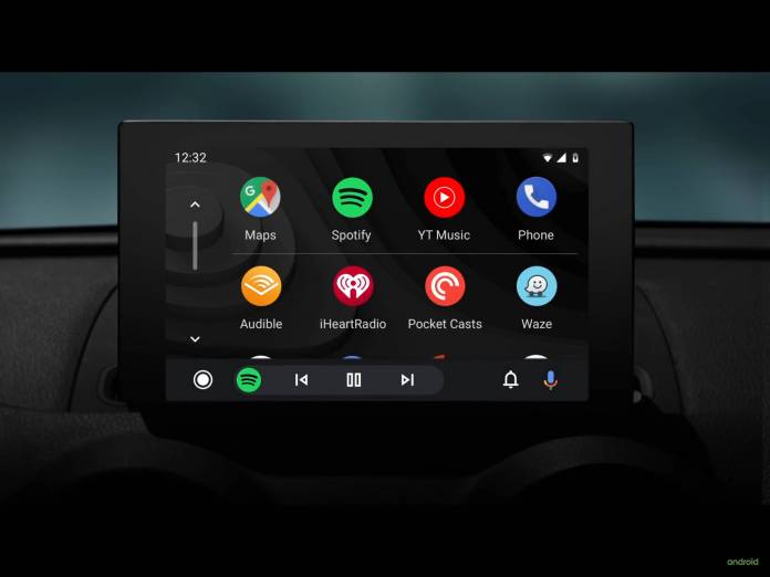
The Google dark mode train just keeps on rolling. We’ve seen several of their first-party apps get this option or at least testing it out on these apps and now Android Auto is the latest one to officially have it. The update to the infotainment platform for vehicles not only bring this new option to have a darker version but also a redesigned interface to make it easier and less distracting for you as you drive and navigate your way through both familiar and unfamiliar areas.
The dark mode was already previously being tested on Android Auto and now it’s rolling out with the stable version. It should make viewing the app easier on the eyes especially during night and in low light situations. Google says it should be able to utilize more colorful accents.The fonts have also been improved to reduce eye strain on the driver or whoever is viewing the Auto app.
But that’s not the only thing that users can expect from this update. According to Phone Arena, you’ll also get a new user interface, include a redesigned bottom navigation bar. You should have an easier time accessing the apps and media as well as managing incoming calls and getting directions.
Because you need to be not so distracted by your Android Auto, this new interface requires less taps and utilizes your screen’s real estate better. It also can adapt to various displays with different sizes, aspect rations, and resolutions.
The Android Auto is a server-side switch so you’ll have to wait until Google turns it on for you. But you can also check if an update is available for you on the Google Play Store.


