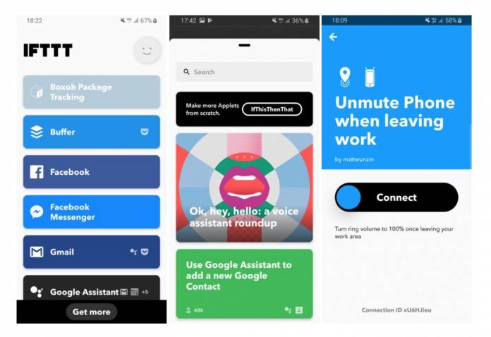
If you use a lot of IFTTT services (If This Then That for the uninitiated), chances are you don’t use the dedicated app that much apart from setting up the various actions and applets that you want to use. It looks like the developers are coming up with a more minimalist looking app and they’re testing the new look and feel in private beta. Based on what we’ve seen so far it may be easier to use but some functionalities have disappeared for the sake of simplicity.
According to the screenshots posted on an Android Police article, the new look is a bit whiter than the current one so they might also be preparing a dark theme. Otherwise, they might not have noticed that users have been demanding for less white options for their apps to optimize battery and their eyes. In any case, the new version is still in development anyway so they should receive feedback from testers about this.
You’ll now see on your IFTTT homepage the various apps that you use and then the applets available for them when you tap on one. There’s also a small icon next to each service so you’ll know (or remember) which ones you’ve connected to it already. Under all of the services, there’s a Get More button so you can browse the various applets they offer or where you can create your own connection in case it’s not there yet.
When you tap on the new full screen design, you’ll see a bigger font and the design has made it easier for you to find and create your own applets. However, IFTTT sacrificed some things for this minimalist approach. The central log listing all your events and errors isn’t that accessible anymore. The dedicated middle tab is also gone now. But those are minor quibbles and new or returning users should find it easier to use now.
There’s no way to force the update for now since it’s still in private beta. Let’s see if they’ll do a public beta next or if they will go straight to a stable version.


