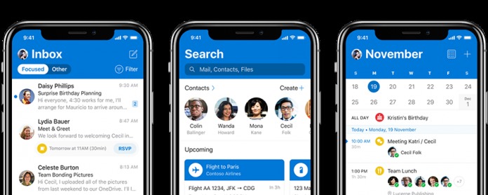
Microsoft has been building (or rebuilding?) a reputation for creating great apps and software for mobile devices. And as part of their goal to become the best in that field, they have opened up their apps to non-Windows smartphones and tablets. Outlook mobile, in particular, has been pretty great and now they are bringing a refresh to the app, at least for the iOS version. Hopefully, this will also be arriving for Android devices soon.
In their official release, they didn’t exactly say that these changes will also be implemented to Android. Either they’re still in the process of developing it or they will be doing something different. It’s more likely the former though as you don’t want a huge disparity between the versions in the two major platforms. So in any case, we’ll tell you about the changes in case you can also expect it on your phone soon.
One of the major changes that you’ll see is it now uses the blue header instead of the white header that you see in a lot of iOS apps. This should make it easier to see when you’re switching between apps. There are also changes in animations and adaptivity in the update. The big header will shrink when you scroll through your inbox so you’ll be able to see more important content. There are also some new subtle animations when you interact with messages in your inbox.
There is also now a new avatar icon so you can easily identify your account especially if you have multiple ones and your contacts will also have their avatars next to their messages. Event scheduling is easier now as the app will suggest events depending on the context of your conversations.
As to whether we’ll see these things on the Android version, that is still unconfirmed at this point. For sure, they will be updating it as well, so let’s just wait and see.
SOURCE: Microsoft


