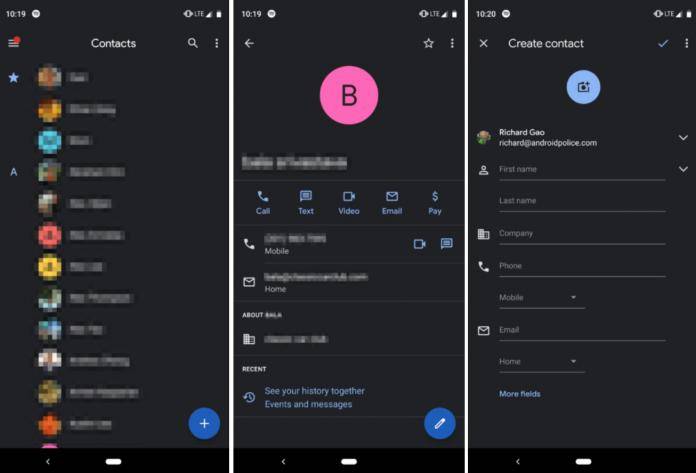
As we’ve recently shared with you, Google admitted that their current Material look significantly eats up your device’s battery since white space is a huge part of their design principle. That is why they are committed to bringing the dark mode options to a lot of their own apps and have also encouraged developers to do so as well. Now the latest Google app that will receive this option is Google Contacts when they roll out version 3.2 soon to users.
There seem to be no other significant update to the newest version of Google Contacts. But for those who have been waiting for this anyway, it doesn’t really matter that it’s the only thing users can expect. We’ve seen dark mode happen for other Google apps, particularly Android Messages and Google News recently. Contacts is another app that we probably use a lot to send messages or make calls to our, well, contacts.
Version 3.1 of Contacts was when the new Material interface first appeared just a couple of months back. Now that we all know (although we’ve known this for some time now, really) white spaces contribute a lot to battery drain, having the dark mode in version 3.2 will be helpful for those who want to save power or just prefer to go dark rather than light all the time.
The dark mode toggle in Google contacts is available in the pull-out menu. However, if you’re seeing the “dark theme in device settings is on” instead of the toggle button, you will probably have to disable the Night mode in the developer options. Then you’ll be able to turn on the dark mode for your Contacts app whenever you want to.
Of course, the update is still not officially out and will probably be rolling out gradually to users. If you want to check it out already, you can always download the APK if you regularly do so anyway.
VIA: Android Police


