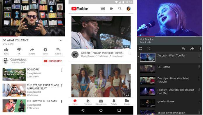
YouTube is more than just a place that you watch videos. It is actually the second most popular social networking site in the world. And it is also being used as a search engine every time people want to learn about things. So they’re constantly trying to add new things and features to the platform to engage more users. But before rolling out updates, they do extensive testing to random users to see if they will work or what needs to be fixed first. This week, we’re seeing swipe gestures to move on to the next video.
Lest you think you can force your app to do this, it seems like they’re just testing it out to selected users. Some have posted that they’re seeing a new feature on their Android app where you will just need to swipe left or right from the edge of your screen to get to the next video. Previously, you could do that by either tapping for the next video or using the forwards or backwards button. But swiping is much more convenient and intuitive than those other ways.
Those who are seeing this feature will be able to swipe through an entire page, from the player window, title, description, like/dislike/share buttons, suggested videos, etc. When you swipe left, it will take you to the video that’s queued in the “up next”. The channel avatar and name bar actually loads immediately after you swipe but the list of “up next” videos takes a bit of time to appear.
You also get a swiping animation that seems to be similar to the Android P’s upcoming new vertical Overview screen where your current screen actually seems like an individual card. You can also swipe right to go back to the previous video you were watching. Based on the video uploaded by a Google+ user, this seems to be a pretty straightforward but useful new feature.
Unfortunately as we said, they’re still AB testing it out to users and we have no idea when an official rollout will happen. Meanwhile, enjoy the latest treat from YouTube, which is the application of the dark theme to the Android mobile app.
VIA: 9 to 5 Google


