App launchers are here to say. They’re not problematic at all as they are only essentially replacement home screens for most smartphones. If you don’t like the UI or default OS screen, you can simply get an app launcher like the Lawnchair Launcher. The app reached the Google Play Store in October last year. It is described as the Pixel Launcher for every Android device. This means non-Pixel phones can run the Lawnchair. While the Pixel Launcher is exclusive to Google-branded phones, the Lawnchair Launcher is ready for most Android consumers.
We’ve heard of the Lawnchair v1. This app is stable and is ready to deliver most Pixel Launcher features. It’s mainly based on the Pixel Launcher but it can be customized by letting you choose the icon pack or the app drawer. Some standard features are available and you can say this one is also similar to the Rootless Pixel Launcher. If you’re familiar with the Pixel Launcher, you’ll notice most features have only been ported to Lawnchair.
Lawnchair Stable v1 features the Google Now integration, icon pack support, Android Oreo shortcuts, notification dots, variable icon size, custom grid size, dock customization, adaptive icons, and optional Blurry UI.
Lawnchair V1 brings stabilization and bug fixes to phones. This final release will soon be available as Public beta for Lawnchair V2 in an about two weeks. Lawnchair Launcher boasts new important features such as Google Now integration. This one is important, especially since this one wants smarter features.
You can head on to the Play Store if you wish to download the app right away. Lawnchair is already a self-supporting launcher but for the Google Now integration, the Lawnfeed add-on app must be installed first. The optional Blurry UI is helpful. As for the Icon Pack support, you can update variable icon size, custom grid size, and dock customization.
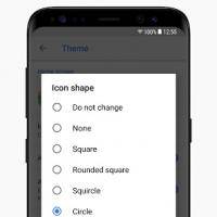
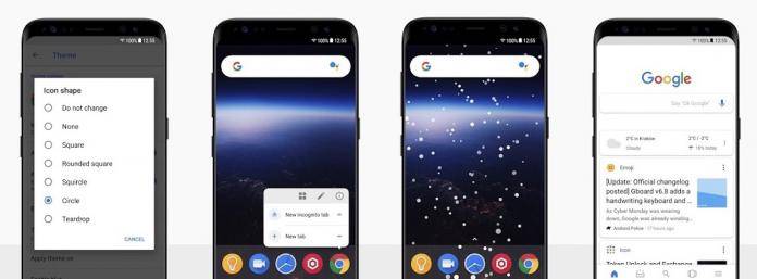
A version 2 is already in the works and Lawnchair v2 remains as a customizable Pixel Launcher, letting you change the shape of the home screen icons (circle, squircle, rounded square, square, and teardrop). For the color scheme of the launcher, feel free to choose from light to dark gray.
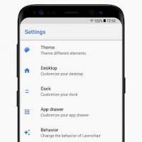
The app brings the Theme category that may also include icon packs and changes on the color scheme of an app drawer. The desktop now receives more toggles plus time and date on a widget. You can also toggle on-off the Google Feed.
Last but not the least, the Dock can change the dock style. It’s up to the user to choose any of the following: Gradient, Flat, Rounded, and Transparent—still depending on the preference of the mobile user.


