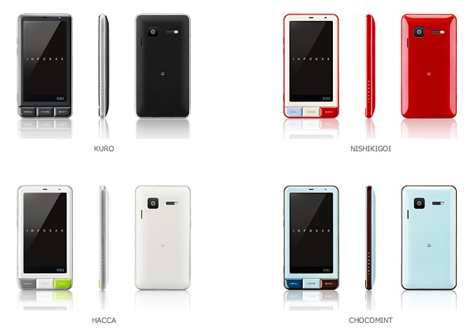
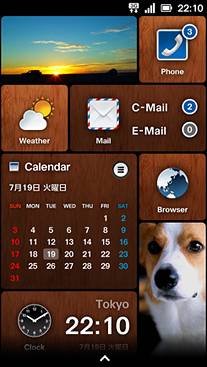
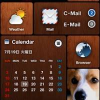
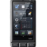
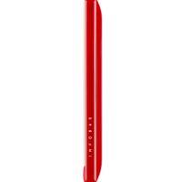
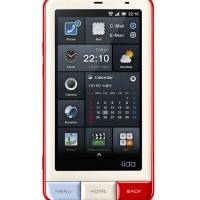
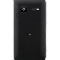
Behold an excellent vision for the very capable Android 2.3 Gingerbread Google mobile OS. This is a vision as constructed by Japanese industrial designer / user interface specialist Naoto Fukasawa who takes the very popular INFOBAR design from KDDI and upgrades it to face off against the iPhone. While you may say “wait, why would he make this phone’s UI look like Windows Phone 7 to compete with iPhone”, you’ve got to appreciate the excellence of the layout.
It’s a big block-oriented interface and it’s right up in your face. What do you think of having what appears to be a screen completely full of widgets? What does it feel like to have TouchWiz 4.0 hit you with no borders? That’s what’s going on right here and it’s certain to inspire some USA XDA ports if it ever ends up being real. Can’t wait to use it!
https://www.youtube.com/watch?v=0S6NMH4ry-4
Meanwhile I’ve got a question for you Android Community members – how interested are you in Japanese import phones? Imagine a world where changing the radio (and therefor the carrier capabilities) of a phone was as easy as flipping in and out your SIM card. Japan (and China, and Korea, and etc) have a slew of excellent Android devices with no ties to Google’s approval process – what else are we missing out on? Behold a much more diverse market than the English-speaking West.
Specs for the INFOBAR A01:
INFOBAR is equipped with Android™ 2.3. This smartphone fits in the hand, yet offers Osaifu-Keitai®, infrared communication, and 1seg TV. With Global Passport, overseas use is also possible.
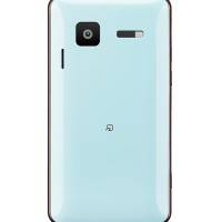
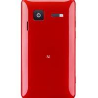
・Camera
Approx. 8.05 megapixels
・Display
Approx. 3.7 inch
・Data Folder Capacity
Approx. 1.1 GB (application space)
*Content data is saved to microSD memory.
・External Memory (maximum)
2GB microSDTM / 32 GB micro SDHCTM(encryption compatible)
・Size, Weight
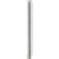
Size: 63x118x11.8mm / Weight: Approx. 113g (provisional)
Specs and Services・1Seg *1
・Osaifu-Keitai®*2※2
・Infrared Communication
・E-mail (…@ezweb.ne.jp)
・Wi-Fi (IEEE802.11b/g/n)
・Bluetooth®
・Global Passport*3*3
A press release for INFOBAR A01 can be found below, translated terribly from its original Japanese:
Expression can produce a variety of thing you want to customize the user interface to their liking. We propose a user interface can feel the joy of the operation itself.
Smooth operation of customization freeThe home screen consists of a simple vertically. You can resize the icon to press and hold, you can freely rearrange. You can also use the section bar, and easily organize your home screen and applications and widgets, you can instantly move to the location of your choice.
“Icons”, “widgets” are continuously connected Orijinaruapuri
1. “Icon”, extend the application displays the information in the “widgets” can be laid out freely and continuously linked to the original application.
2. HOME as well as on the application icon, or even side by side and photos taken with the camera and your favorite photos, you can keep notes, and world clock. Also, you can easily play music from the home screen jacket and see at a glance the title during playback.
Free to change the home screen theme
INFOBAR from a variety of topics designed to fit the worldview of the home screen can be set free to choose a theme. Normal Android home screen is also available on the home screen by right-flick.
DESIGNER
Nakamura Yuugo
Web designer / interface designer /
Film directorBorn in Nara Prefecture in 1970. Engineering graduate from University of Tokyo. Visiting Professor, Tama Art University. Web design since 1998, and worked in the field of interface design. Design studio since 2004 “tha ltd.” Founded. Since then, a number of websites and video art direction / design / programming in the areas of cross / longitudinal to continue its activities. The main work, a series of Uniqlo Uebudirekushon, KDDI iida CM website and brand image direction, NHK educational program “Ah” Design and directed. The main award, the Grand Prix Cannes Lions International Advertising Awards, Grand Award Tokyo Interactive, TDC Grand Prize, and the Mainichi Design Award.



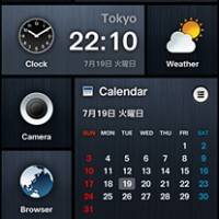
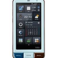
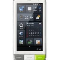


I like the accordion panels–easy to group things together and access them quickly form one screen. Doesn’t look like the widgets are resealable which would be perfect for that type of setup. which would be perfect for that type of setup.
This is slick. One of the benefits of so-called “Android fragmentation” is rapid evolution of the UI. I like the looks of things like SPB 3D and now this. I love the way Android launcher development is moving so far beyond the iPhone’s “pages o’ icons” UI.
Wonder how much time ’til we get a rom of this we can port to other models.
I want it, when can I expect to put this on my Evo? Come on XDA Dev, make it happen!
What do you mean no google? They dont use android market?
Did they copy the WP7 style of interface by just loading the screen with Widgets?