If you’ve been using Microsoft’s OneDrive and/or SharePoint for some time now or if you’re thinking about switching from whatever file-hosting service you’re currently using, you’ll be happy to know that they will be rolling out a new design and user experience. The update will arrive over the next few weeks that should make it easier for you to use the service across all your devices and platforms. This should make it more attractive to those looking to make a switch from Dropbox or Google Drive or other cloud services.
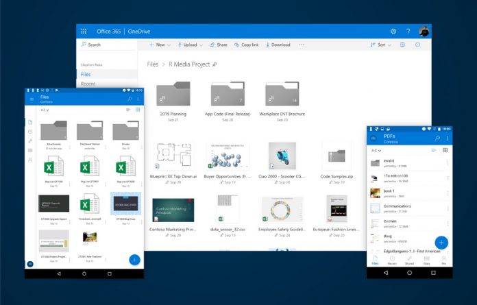
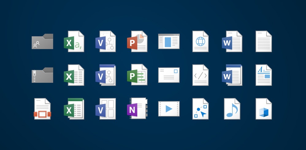
First off, the new design uses your screen space more efficiently, as the thumbnails are bigger and more detailed, shared and new files are easier to see, and shapes and colors are now more familiar. The themes and designs are also now more seamless between your devices, whether you’re on your smartphone, tablet, desktop, and web interfaces. Even the file icons are now more recognizable as they are more “modern and lightweight”. All of these redesigned things should make it easier to look for the files that you need at that exact moment.

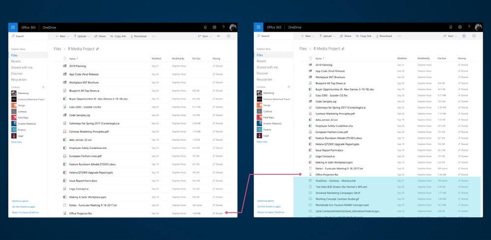
You can also now preview your files without having to open them. This is applicable to over 270 file types including Visio, Adobe formats, Office 365 files of course, and even DICOM medical imagery among others. You also get essential metadata and insights into the file cards, so you don’t have to open a file to check it out. You also now have a “high-density list view” which is the closest you can get to the Windows File Explorer type of file listing. Another new thing you can expect is that there is an indicator on the icon if it’s a popular file or a new item.

The update will rollout to OneDrive and SharePoint users over the next few weeks. So just be patient and always check your Android device if the update is already available.
SOURCE: Microsoft


