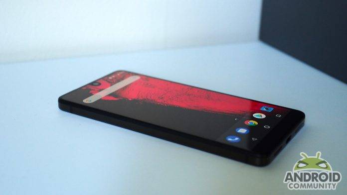
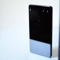
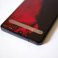
I like vanilla ice cream. There’s nothing terribly exciting or flavorful about it, true, but it’s the ideal base for adding on whatever toppings your taste buds desire. In many ways, Essential’s first phone is the vanilla ice cream of the mobile world. The hardware isn’t that exciting at first glance: it looks like a slab of glass, no matter how it’s held or placed on the table.
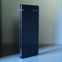
Like the ice cream, though, the Essential Phone is the base for what’s to come. It’s been a while since I’ve held a device that speaks to me through the sense of touch. The titanium enclosure isn’t slippery like most devices on the market right now. The texture of the ceramic back, mated with the titanium body, feels raw and real – it’s a wonderful sensation to the touch that’s difficult to explain, and can only be experienced in person. Not only do they look great together, the form has true function. Should you ever drop the device, it should – in theory, at least – survive a drop with minimal damages, unlike more widely-used materials such as aluminum.
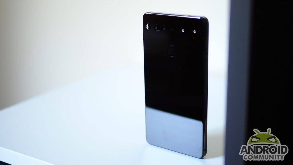
Andy Rubin, Essential’s founder, says that when you purchase a phone, it’s yours, and as such you shouldn’t have to broadcast to the world who made it. You won’t find a single letter of any sort on the device. There’s no logo, “made by”, FCC text of any sort, or especially carrier branding anywhere. Bravo Essential. This goes for the operating system, too. If you purchase the phone from Essential, it comes unlocked and the Android experience is as pure as what you’d get from Google’s Pixel branded-devices. However, should you purchase it from Sprint, which is the only launch partner, there are only one or two basic applications that gets installed.
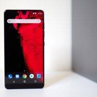
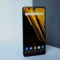
Look at the phone head on, and you find the most eye-catching part: the display, covered by Gorilla Glass 5. In the top center is a cutout for an 8-megapixel camera with a 16:9 ratio, f/2.2 fixed hyperfocal lens capable of shooting 4K video at 30 fps, 1080p 60 fps, and 720p at 120fps. Other than the camera, it’s nothing but 2560 x 1312 quad-HD resolution, edge to edge. The display is absolutely brilliant, mainly due to the bezel-less design. The app icons appear as it they’re floating. The 5.71-inch display, with its 19:10 ratio, is possibly my favorite combination for a mobile phone because it offers a large screen while still being small enough, in my hands at least, to reach near the top with my thumb.
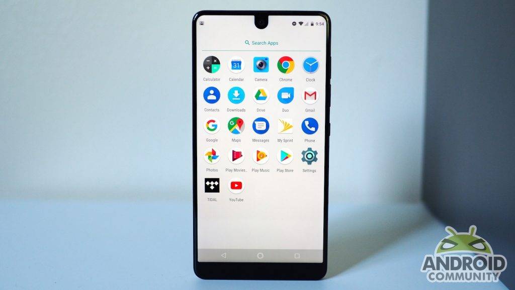
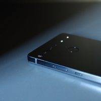
Depending whether you’re using it with your right or left hand, the right-side mounted volume buttons and power key are easily accessible with your the middle finger if you’re using it with the left hand, while the right thumb has perfect access if you’re using the right hand. The fingerprint scanner is by far the best and most comfortable position I’ve experienced on any rear-implemented device. The index finger naturally rests on it, requiring little reach or effort. That’s not something which can be said for the Samsung Galaxy S8 or, especially, the S8 Plus.
The dual rear cameras consist of a 13-megapixel dual RGB and a monochrome camera with image fusion technology. What’s image fusion technology? In a nutshell, because the mono camera doesn’t have to process the RGB color section, it therefore can take in much more light. Its data is then overlaid onto the dual RGB camera, and the result should be much better image quality. Huawei and its partner, Leica, were one of the first to use this technology.
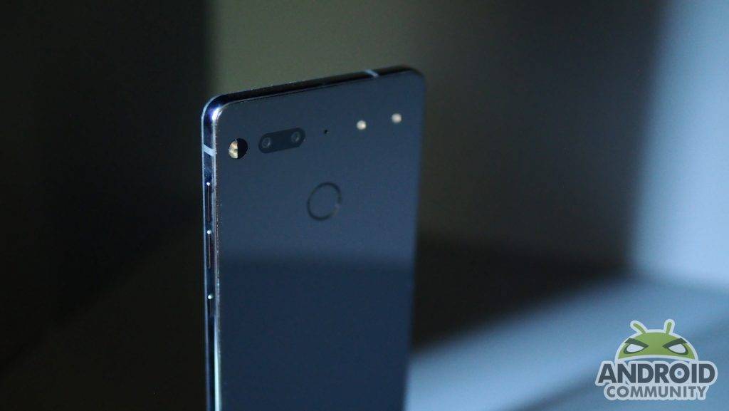
I’ve shot hundreds of pictures over the past couple of days, with mixed results. At the time of writing these initial impressions, I can’t fully judge whether Essential has nailed it because I think that it’s still too early to accurate assess the results. Of course, there’s still a lot of room for improvements, especially with features in the camera app.
It’s fair to say that’s barebones right now. The “Settings” menu consists of two options: play shutter sound and store location. I’m all for minimalism, but this is a little too bland-vanilla even for my tastes. On-screen controls include the button to flip between the front and rear facing cameras, set timer, and a key to cycle through 4K, 1080 at 60fps, or 720p at 120 fps video resolution. Below the camera cut out, there’s the icon for the new HDR feature which was rolled out late on Thursday night; the last two icons consist of flash options and that sparse settings page. Shooting modes are as basic as they come: auto, mono and Slow-Mo. Lastly, there’s an icon for the last image taken, shutter button for stills and below that, the video record button.
As of right now, “Pro mode” – consisting of manual exposure and other features – doesn’t exist. Essential tells me that it’s coming soon for stills, though will take longer for videos. Speaking of shooting videos, touch to focus is missing as well as manual exposure, which happens to be missing from taking stills as well. This is expected to roll out when the device is available to general consumers.
The cameras lack optical image stabilization. Essential believes that, between its camera with fusion technology, the f/1.85 lens, and a whole host of digital autofocus tech, it should be more than sufficient to capture a decent shot. That may be the case in some shooting situations, yes, but I still suspect I’ll miss OIS’ absence.
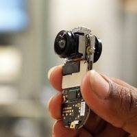
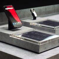
As of right now, the value proposition for the Essential Phone weighs heavily on modules. This is clearly a work-in progress, both the software and the ecosystem overall. That being said, it’s a little difficult at the moment to thoroughly review the hardware components such as the camera quality because Essential is still flushing out even the most basic features, like manual exposure. As for 360 camera module, I’m told that it’s coming “soon”. Think of this article as part 1 to many to come, so I invite you to bookmark this page and revisit for updates.














Looks like amazing phone, when will be it available for purchase ?