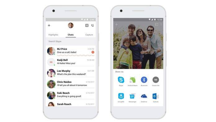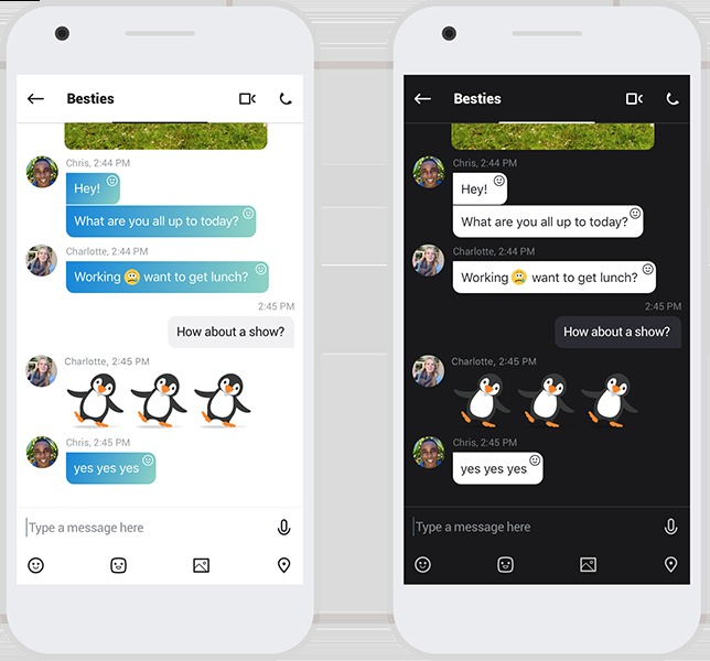
The relaunch of a brand new looking Skype was met with mixed reactions, even as Microsoft says they’ve received “a lot of great feedback” from the community. Of course they wouldn’t admit that there was a lot of criticism from long-time users but now they say that the latest update is based on several comments and suggestions from those who tried out the brand new app and service. They’ve brought back the status display for the home screen, as well as new themes and even an updated UI for easier use and navigation.
One of the criticism about the new app was the removal of the status display for contacts and so naturally, they’ve brought it back. It’s now easier to see who among your contacts are online, active, and who are not. You also now have native sharing capabilities so you can share content from other apps and services onto your Skype conversations. You also get more themes and colors, as well as a slightly improved UI for easier navigation and access to conversations.
A previous update also brought some minor improvements, like the ability to delete contact and conversations, which should probably have been included initially. If you’re on a call, you can also now multi-task, like watch a YouTube video or search for something on Google. The notifications were also improved with that previous update.

It will probably take some time for users to get used to the new look and direction of Skype, but if they keep listening to feedback, we might just get to it faster. You can update your Skype mobile app through its Google Play page.


